10 Strategies for Images in Newsletters to Boost Email Engagement
Imagine an image-free newsletter. It’s all text and CTA. Your immediate reaction would be to quit the email and look for better emails from “better, more serious brands” in the inbox.
Why the quotes? That’s the conclusion you’d draw from such emails. It instantly directs the recipient’s attention to the brand. The attention is negative and often the last of its kind. The next time the brand sends an email, the user will not bother to open it, and rightly so.
That’s the power of images. And yet, adding images is not enough. You must have a strategy to back up your action.
Boost Email Engagement with Effective Image Strategies in Newsletters
In this post, we will look at ten such strategies to leverage images to the hilt and boost email engagement. Let’s begin!
Always Remember to Add ALT Text
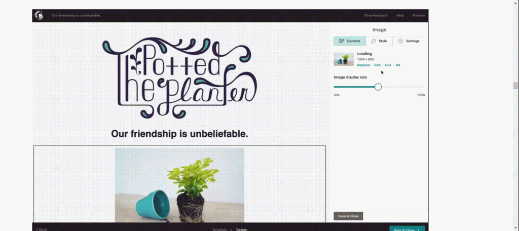
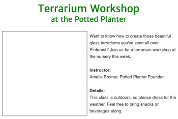
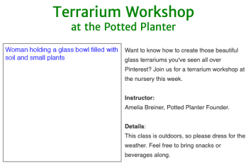
Many popular email clients don’t support images by default. In the absence of images, the ALT text explains what the image is about. For instance, consider the following Mailchimp email newsletter template with and without ALT text.
Source: Mailchimp
The first image is without ALT text. The client doesn’t support the image, so it’s blank. The second image provides a descriptive ALT text, letting the viewer know what the image shows.
Use High-quality Images in Newsletters
To really nail it home: there is no alternative to high-resolution images. You either use high-res images or you don’t. Low-res images look spammy to users. Here is a vivid example of the use of high-quality images in a newsletter.

Source: Really Good Emails
Pay Attention to Image Size Best Practices
Here is the tricky part. We stressed the importance of using high-res images. At the same time, you need to stick to image size recommendations.
Generally, email clients don’t support wide templates. The maximum width you may use is 600 pixels. In addition, we recommend keeping your images under 1MB. What about loss of quality, you ask? You can reduce the file size using online tools with only negligible quality loss.
If you are using Mailchimp templates, you can use Photo Editor to fix image size.
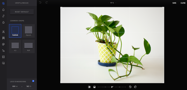
Source: Mailchimp
Take A Mobile-first Approach to Images
Most of your subscribers are likely to view your images on mobile devices. So, if you take a mobile-first approach to images, you can rest assured that your images will look alright on the desktop as well.
Readability is also a major criterion for engagement. Make the fonts large enough so that your text is readable when scaled down for mobile viewing. Here’s how you can optimize your email newsletter for mobile viewing on Mailchimp.
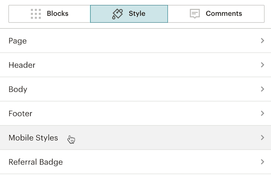
Image: Mailchimp
Balance Text And Image in Your Newsletter
While this is generally true for emails, it assumes greater significance in the case of newsletters.
The typical newsletter is mainly informative, therefore more textual than imagistic. Of course, it may vary from brand to brand. In any case, maintaining the balance is important.
Why? At its simplest, a balanced template looks nice. More importantly though, many email clients determine whether an email is spam or not by looking at the image-to-text ratio.
The ideal image-to-text ratio would be 60:40 or 80:20. We recommend going for the latter measure i.e. 80% text and 20% image. Here is an example of a nicely balanced email newsletter template.

Source: Really Good Emails
Maintain Brand Consistency in Newsletters
Your newsletter represents your brand. As we mentioned at the beginning of this post, any inconvenience on the subscriber’s part will inevitably affect their perception of your brand. Experiential consistency promotes approval.
Consistency must not however limit creativity. Consistency is not sameness. It is also not about recognition as such, though it includes it.
Primarily, brand consistency refers to the consistency in character. Here is an illustration of what we mean. Playdate’s newsletter is characterized by humor as well as the more obvious hallmarks of its brand image such as brand colors (black and yellow in the case of Playdate.)

Source: Really Good Emails
Place The CTA Button(s) Outside Your Image(s)
We have already talked about the limitations of certain email clients when it comes to loading images. If you place your most important CTA button inside an image and the image doesn’t load, the viewer will have no idea what to do next.
The call-to-action button is the most important element in an email. Make sure it is prominent and clickable, especially on mobile devices. The following email from Oakley, while not a newsletter, illustrates our point perfectly.
Additionally, incorporating a well-designed email signature at the end of your messages can further enhance your professional communication. This signature can include your name, title, company, and contact information, providing a convenient way for recipients to reach out or learn more about your offerings.
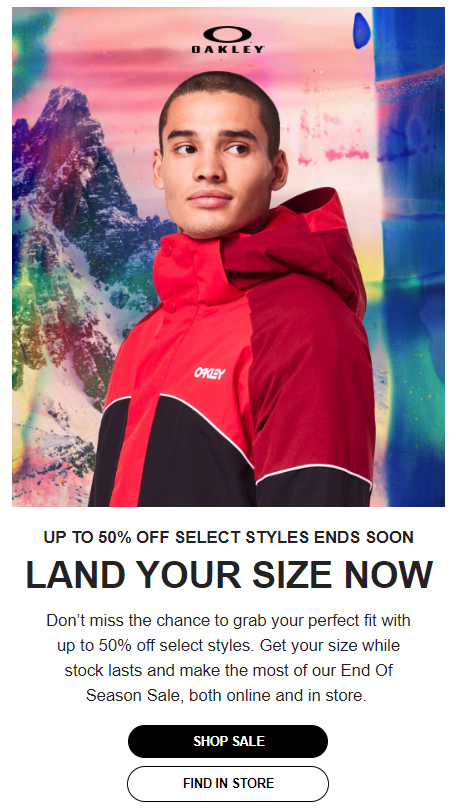
Source: Oakley
Be Careful while Using Stock Photos
You can use stock photos, but you need to customize them to fit your brand. While it is best to use original images, your inhouse collection may run out of images at times. In such cases, feel free to use a stock image.
Another increasingly popular method is to generate AI images. There are many free AI tools that can churn out high-quality images in no time.
Choose The Right Image Format
Using the right image format is crucial to the effectiveness of images in email newsletters. The two most popular image formats are PNG and JPEG.
The JPEG format enables you to reduce the size of an image up 100 times without sacrificing color. As a result, you can use this format to share light images which will not affect email load time.
However, unlike PNG, the JPEG format sacrifices image quality on compression. The PNG format supports compression as well as transparent backgrounds. But it also has its limitations. For instance, old browser versions do not support PNG.
Other image formats include SVG and GIF (see image below). But how do you know which is the right format? There is no definite answer. Your choice will depend on the content of a particular image. So if you want an animated image in your newsletter, choose GIF. If you want images to retain their color, go for JPEG.
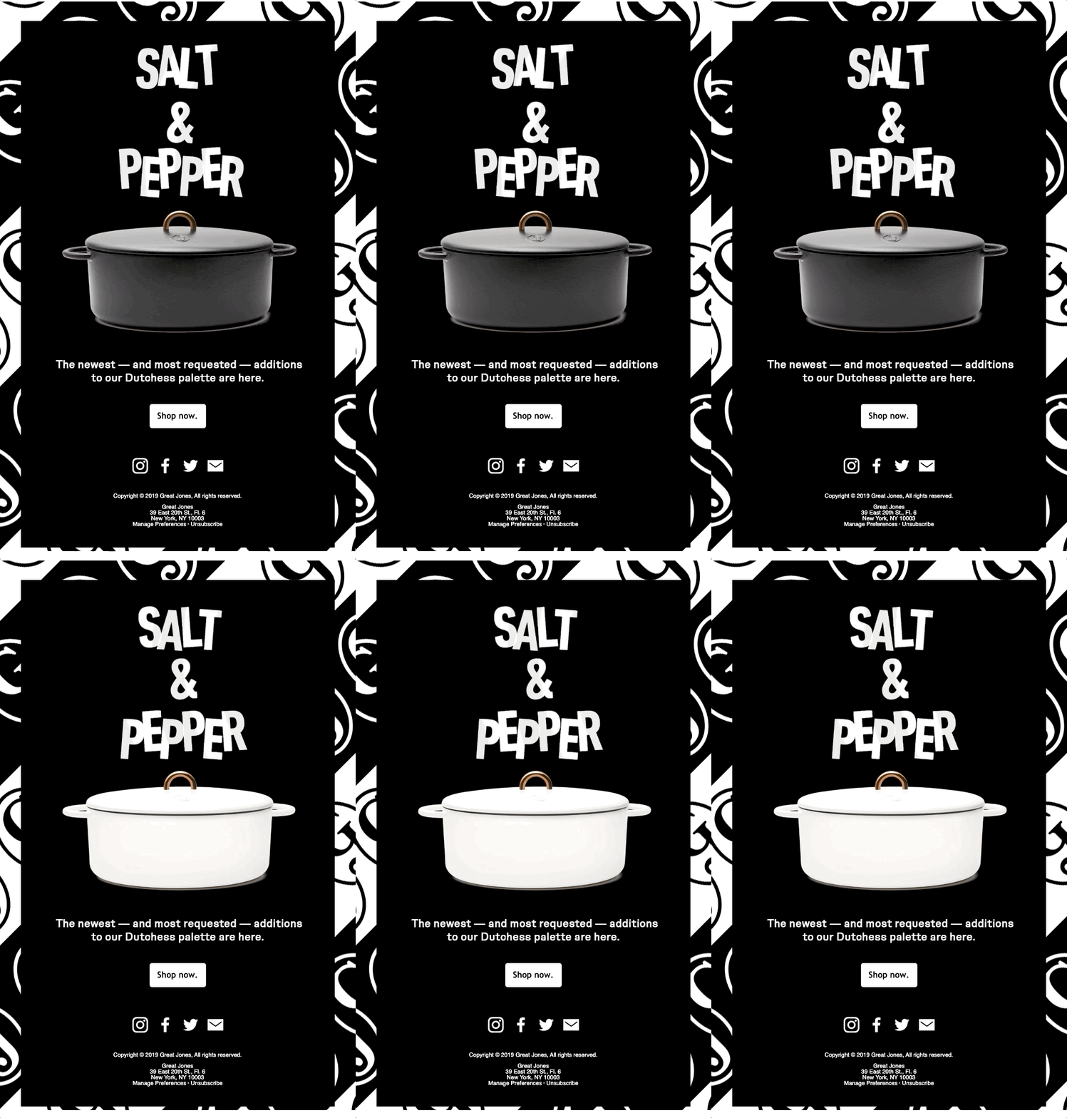
Source: Really Good Emails
Use An Online Tool If You’re Not A Designer
If you are not a designer or are not sure of your design skills, you can always choose an online tool to create images for your email newsletter.
For example, Mailchimp’s Photo Editor (see illustration below) can help you with adding images to your email templates.
Source: Mailchimp
The Bottom Line
The human brain registers visual information far more quickly than textual information. Where text merely informs, visuals deliver experience.
Images are known to boost email engagement, provided they are relevant to the content of your message. Instead of adding images for the sake of it, you want to ensure that your images do justice to your newsletter content, and ultimately help you with your marketing goals.
Remember to share your newsletter with your people in your network using a digital business card to expand your reach.

