An Easy Guide for Selecting the Perfect Font for Website
Website design is an essential and comprehensive process that entails so many tiny details. From the margins and paddings and placement of logos to the proper connection of social media channels, all can leave a massive impact on the overall success of your online presence.
What separates an engaging and successful website from an ordinary or amateur one is the ability to align all these elements in a logical and perfectly-balanced order.
One of the most significant, and also small differentiators in this regard is the typography you use for your site.
Your font for website tells a lot about you to your audience, and you can’t attract them to read your content unless you glue this piece of design elements to other parts efficiently.
Typography is more than just words, and it might be interesting to know that Steve Jobs made a breakthrough in his time by creating ten different designs for the fonts that were going to be used in Mac!
Read on to get more information about the significance of this element in your online success and find out about the ways you can choose the perfect font for website that best matches your identity.
Writing Styles Website
When users search for a writing styles website, they’re often looking for tools, inspiration, or guidelines to help them craft content that’s both clear and compelling.
Writing style goes beyond tone and grammar—it’s also about how content is visually presented, and that includes font choice. A clean, readable font enhances your writing’s impact and supports the user’s reading experience.
some of the most popular writing styles websites are:
These are great resources for refining your writing style, while design-focused tools like Google Fonts and Typewolf help ensure your typography complements your tone.
In this guide, we’ll focus on how selecting the right font plays a key role in shaping the overall writing style of your website.
What Font Type Should I Use?
There are so many exceptional font designs that can convey messages differently. But generally speaking, the present typefaces are categorized into six distinct groups as follows.
- Serif fonts
- Slab-serif fonts
- Sans-serif fonts
- Black lettering fonts
- Display fonts
- Handwriting fonts
Let’s get down to a more detailed description regarding each type and form a better idea about the way they should be used.
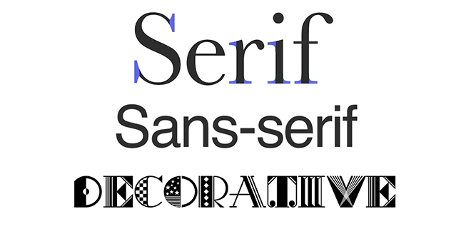
Serif Fonts
The oldest type of fonts being used in the world of design is the serif family, which has a kind of edge at the end of the symbols.
They can provide the webpage with a more distinctive character, but we should forget that they are most appropriate when used for high-resolution designs.
Overall, the fonts with medium sizes are proper for the typefaces that have serif fonts. Currently, Times New Roman, with the size of 14-16pt, is the most popular font used for printed documents.
What your readers can feel upon seeing this font on a website is a sense of classic or literary content.
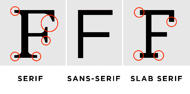
Slab-Serif Fonts
The serifs or edges used in this font family are wider and thicker than the previous type. So, they are less readable and not a good candidate for long lines of texts.
Alternatively, we can use them for titles or short sentences to make them appear different from the other parts.
Sans-Serif Fonts
The word “sans” has roots in the French language, and it means “without.” What separates them from the serif group is lacking the edges on alphabet letters, and therefore, they are considered to be simpler.
These fonts appear in various rounded, thick, and light types that bring us so many styles.
Reading texts with this font for the website requires more time since it decreases the readability of characters. However, they are widely used on the web.
For instance, a geometric font in this group entails excellent visibility for the body of a text. The most well-known sans-serif font is Helvetica, in which the height of characters can be easily distinguished.
This feature makes it a proper choice for both headings and body texts.
What designers advise us to do is following a combination of headings, images, and blocks of texts so that our eyes can get along with the transitions much more effortlessly.
Black Lettering Font for Website
If you are thinking of an ancient or gothic style, go for the black lettering font family. This tough and difficult-to-read style of font is mostly used in editions of the books that are antique.
Needless to say, it is not proper for text bodies, and we can use them for headings or short sentences to make a difference.
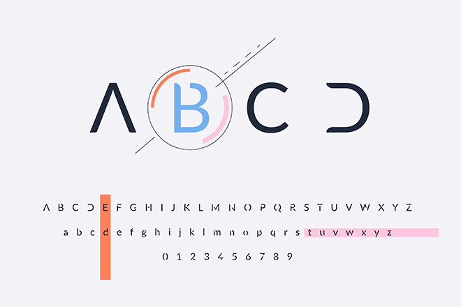
Display Fonts
Display fonts, aka decorative fonts, usually have no design guidelines to be described with. They are supposed to engage audiences and appear to be cool in their eyes!
The main focus of this group is delivering the emotion and feeling behind the content you have put up on your website.
Making proper use of them carries weight in properly engaging your readers so that they won’t run away from what you have shared with them.
The main usage of this group is the headlines, and they should not be applied to your paragraphs.
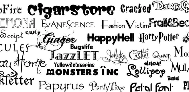
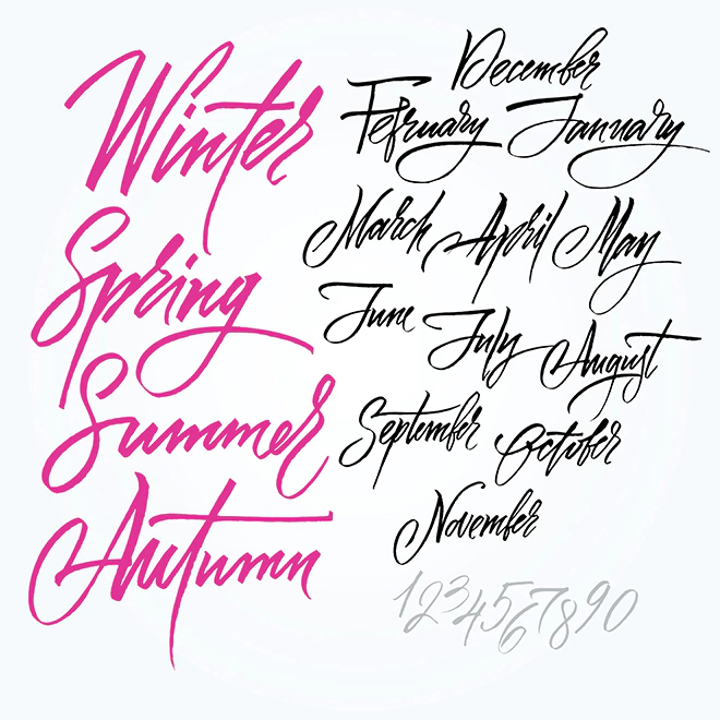
Handwriting Fonts
Handwritten fonts (often called script fonts), as the name implies, are based on the human physical handwriting that covey a sense of informality and personalization.
While mostly being used for decorative designs, they can add elegance to headings and logos.
The best way to use this font for the website is to apply it to the quotes, which makes them stand out from the rest of the paragraphs.
The decorative nature of this group decreases their readability, and therefore, they are best suitable for short lines of texts.
Make the best out of them with the mindset of creating contrast on the page.
According to the unwritten laws of design, you should avoid using more than three types of fonts for a single project.
In the best case for choosing the best font for website, you need a font for titles, one for the main texts, and a third font for the description or quotes. The point is that each group should be written with no more than one font.
How to Choose the Perfect Font for Website?
Before diving into the different considerations, beware of the licenses that limit the usage of some fonts.
Although the majority of available fonts can be used for free, double-check the restrictions prior to using any specific family of fonts.
You can find free fonts from the library of Google fonts, or pay for a membership fee to utilize Adobe fonts collection or Envato Elements fonts collection.
This way, you will be sure that whatever font you use is approved by the typographers all over the world.

Clearly Define Your Tone
The font you use on the web speaks for your brand and business. Making up your mind about the font to use can be extremely daunting in the first place. Therefore, you’d better start from the basics.
The available brand tones can generally be considered as confident and stable, mild and conservative, and creative. Choosing the correct path can assist you in selecting the proper font immeasurably.
The font type highly depends on your target audience and the feeling you want them to get from your online presence.
The sans typefaces give a more modern appearance to your website compared to serif fonts and are proper choices for symbolizing simplicity and minimalism. Serif fonts, on the other hand, convey a formal tone.
Start by asking yourself simple questions. What would be the nature of your brand? What is the type of project? Is it a long-term activity or a short-term one? Do you prioritize functionality over standing out from others? Do the visual elements outnumber texts on your pages or vice versa?
On the other hand, you can keep the information of your prospects in mind, too. What is the ideal age to be best interested in your services and products?
How about their gender, should your content mostly favor men or women? What are their job and industry?
Other tiny details can similarly help you with the correct tone. For instance, left-aligned blocks of sentences are the easiest texts to read, and you can appear to be more formal if you justify them fully.
Ragged texts are more friendly, and the most desirable length of a line is between 45-80 characters (spaces included).
Choose the Appropriate Typefaces
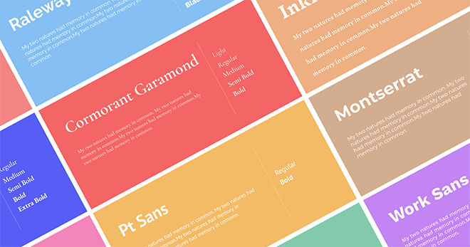
Now that you know what you want from your typography, it’s time to go for the font families. As mentioned earlier, you should limit your font for website choices to a maximum of three groups.
Rank the fonts based on their importance and put them into three groups, as mentioned below.
The Main Font
This is the font your users will see most, and therefore play the most significant role in conveying an appropriate picture of your brand.
The primary fonts are applied to larger texts that catch the sight of website visitors in the first place. It’s often advised to keep some similarities in the primary font’s style with your logo.
The Secondary Font
You use this font for the main blocks of sentences you write on your pages. Readability is what matters most for this group of fonts since you don’t want to make your potential customers’ eyes burning after making endeavors in reading your lines.
The Accent Font
The third typeface is optional. If you like to make use of another typeface, use it for other elements such as CTAs or navigation.
It should easily attract the attention of your audience and encourage them to click on that section.
Keep in mind that the more fonts you use, the harder it gets to harmonize the style you want to apply to your site. Using a combination of fonts can result in various moods in different parts of a site.
Furthermore, most famous fonts are versatile since they are equipped with different weights, often called “bold,” “light,” and “normal.” This variety is good enough as it helps to create a perfect appearance on pages.
Paring different fonts is an overwhelming task, which is, in many cases, far beyond the ability of many people.
Try to establish a sensible contrast by playing with the way your fonts appear, like changing style, size, and spacing.
As a piece of general advice, say a determinate NO to using so many font families as it confuses your website visitors and decreases their engagement.
However, if you need assistance in font pairing, check out MailChimp’s guide and the Fontjoy websites.
Check Compatibility and Performance
Speaking of compatibility for choosing the perfect font for website, you should make sure that your pages are easily read on both desktop and mobile devices.
Mobile screens may not show some fonts with “normal” weight readable enough, and therefore, many designers use heavier weights on these devices.
The loading speed of your pages leaves a considerable impact on user engagement and your overall success.
After loading the chosen fonts on the website, check their performance so that they don’t take a very long time to load.
If that is the case with the selected font, go for an alternative. Moreover, you don’t want people to see system fonts instead of the typefaces you have applied to your site.
This happens when browsers can’t support displaying some specific fonts. So make sure you check this issue beforehand.
As a precaution, pick a similar font to the ones you choose to be used in case the system fails to load the main ones.
The Bottom Line
Apart from the visual elements such as pictures and motion graphics that make for an eye-catching website, what users will see most is the text form of information.
To be more precise, above 90% of a typical website consists of typography. This importance and the complexity of choosing combinations of fonts for a website should not let you down easily.
Simply follow the easy-to-understand rules mentioned in this review and pick the ones that can satisfy most of your expectations.
Keep readability in mind, and double-check everything before making the final version of your website available to users. Choosing the perfect font for your website can dramatically change the user experience in your work.