9 Ways to Create Accessible Web Content
During my research on web content accessibility, I stumbled upon some eye-opening statistics. Did you know that a significant number of people with disabilities are affected by website accessibility issues? The numbers are truly staggering.
Just imagine that around 15% of the world's population has some type of disability, as reported by the World Health Organization. In the USA alone, approximately 61 million adults, or about 1 in 4 adults, have a disability.
It would be foolish to ignore the possibility that a specific segment of your target audience may need assistive technology to access your website. Moreover, many businesses consider and include disabled people when creating customer personas.
It isn’t enough to publish polished-looking content; today, it is a necessity to make your web content accessible to all users. Fortunately, Google regularly introduces new accessibility features and updates to enhance the accessibility of digital content.
To avoid barriers to certain people's enjoyment of your content, you should learn more about web content accessibility and consider the tips below to broaden your audience and increase conversions.
What is Accessible Web Content?
Accessible content gives all users equal access to online materials and information, including people with disabilities. This group of people is extensive, and they often can have more than one type of disability.
To be brief, individuals may have the following types:
- Cognitive, learning, and neurological disabilities – memory impairments, autism, Perceptual and mental health disabilities, ADHD, and seizure disorders;
- Visual disabilities – low vision, color blindness, and blindness;
- Auditory disabilities – deafness and hard of hearing;
- Physical disabilities – arthritis, paralysis, amputation, and repetitive stress injury;
- Speed disabilities – stuttering, dysarthria, and muteness.
When creating accessible content, you should follow a particular set of guidelines to consider all these types of disabilities. That will increase the user experience for disabled people and broaden the reach of your digital products.
To make your content accessible, consider the following accessibility principles:
- Operable;
- Perceivable;
- Robust;
- Understandable.
You can read here to learn more about each principle in-depth. Focusing on these principles means considering how people interact with content. For example, people might:
- Use a keyboard rather than a mouse;
- Use voice commands to navigate through a website;
- Use a screen reader to have the content reach out loud;
- Use a screen magnifier to make all or part of the screen bigger.
The Importance of Accessible Content
As we work with many clients, including law firms, we have recently noticed the following common practice: If your website is inaccessible to all users, people with disabilities can take legal action against businesses.
Here is what Adam Zayed, founder of Zayed Law Offices, says:
“Over 3000 lawsuits filed in federal court under the ADA have been filed since 2013. These lawsuits claim that some websites were not easy to use for disabled people, that are against ADA Title III Requirements. This increase in lawsuits shows a noticeable rise over the years.”
So, making your site accessible is becoming not just a moral obligation but a legal requirement.
How to Make Your Content Accessible
Creating and promoting accessible content and web accessibility is essential, and it's equally important to consider how to achieve this. Here are some practical and easy-to-implement tips to remember when creating your following content.
- Optimize Title Tags and Headings
Optimizing your title tags and headings is one of the best ways to improve your SEO efforts and organize your content logically. Use clear and unique page titles and headings in the correct order to ensure people can easily understand your content’s structure and find the information they need.
When visually impaired users use a screen reader to access your website, the title tag is read out loud. Search engines also use these tags to understand your page's content. So, it's essential to include relevant keywords in your title tags.
Another aspect to consider is structuring your content with headings, as this helps enhance the readability of your website. With assistive technologies, people with disabilities can read only the parts of your content they want instead of the entire page.
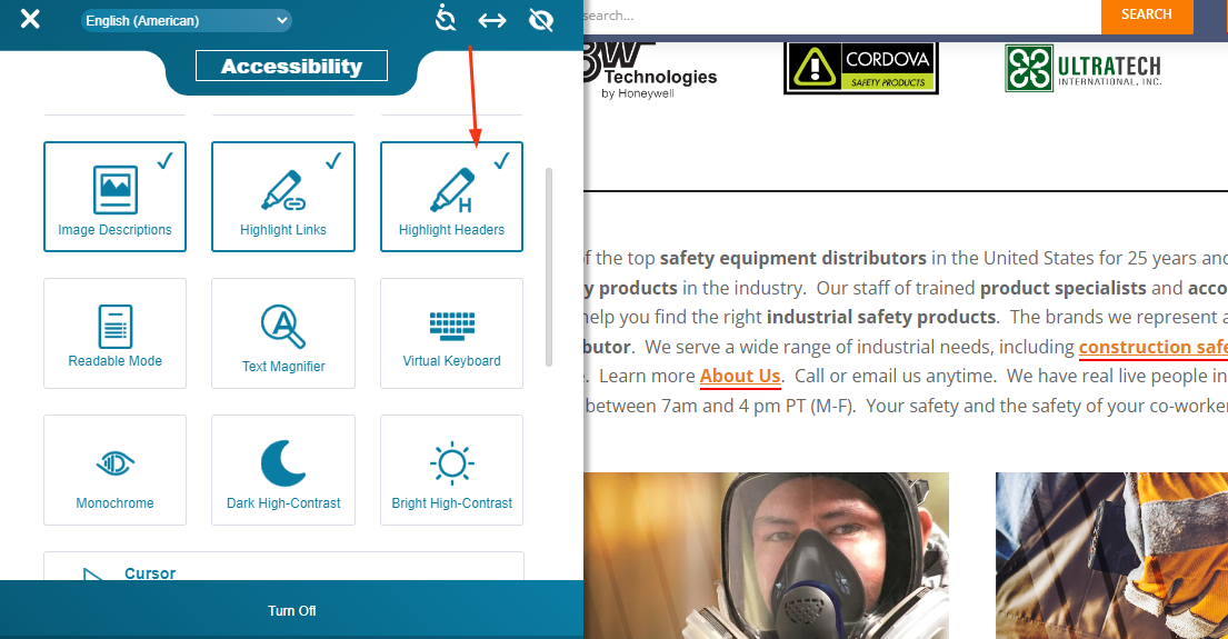
Ensure your headings are in the right order (H3 after H2, etc.) and that each heading precisely describes your content. Use only one H1 tag and include subheadings in your web pages.
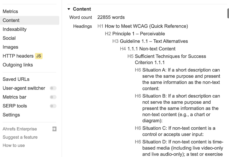
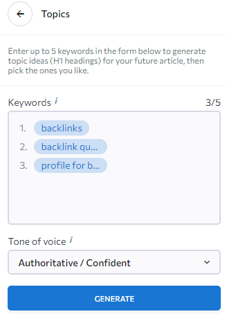
You can use SE Ranking AI Writer to simplify the entire process and quickly generate the structure of your content by including up to 20 targeted keywords. You just need to specify your topic and use suggestions from the Topics menu.
- Make Your Social Media Content Accessible
Many business owners prioritize making their websites accessible but often overlook their social media channels. Users with disabilities may encounter barriers when accessing information or engaging with content on social media platforms.
Some social media marketers hesitate to spend time on social media accessibility because it's not required under WCAG 2.1 accessibility standards. However, 81% of customers say social media posts affect their buying choices. So, it's essential to reach out to as many social media users as possible, including those with disabilities.
To make your social media content accessible:
- Describe your images: Add Alt text to help people who are blind or partially sighted.
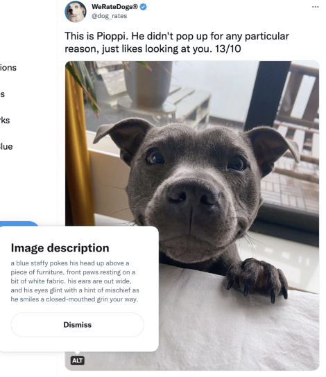
- Add transcripts and captions to videos: You can put them on the same page as the video. That will make it easier to skim through the transcripts with the sound off and allow screen readers to read them.
- Include a Sign Language interpreter, which can be included with videos to make them more accessible, along with captions and transcripts.
- Add a description to your audio or video to help disabled people understand what is happening without dialogue.
- Write accessible hashtags: Capitalize each word, like #SocialMediaOptimization, to make it easier for screen readers to understand each word separately.

- Don’t use many emojis: When using a screen reader, every emoji's name is read aloud, which can be challenging for users.
- Utilize social media scheduling tools to save time and enhance your content's effectiveness by ensuring your audience is engaged when they're most active.
- Make social media sharing buttons or embedded feeds accessible: These features should be operated using the keyboard without causing any distractions.
- Create Accessible Form Fields
When screen readers read a webpage, they do so from left to right, top to bottom. However, online forms or tables with nested tables and spans make it difficult for them to interpret the content. That can make it hard for visually impaired users to understand the webpage's layout and structure.
It is essential to make your online forms and tables accessible to all users, even those who use assistive technologies. You should add descriptive text to each form element, including drop-down menus, buttons, or text boxes.
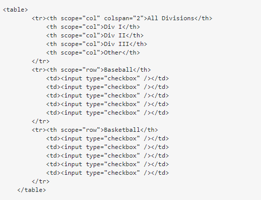
Include an auto-fill option in the forms for a better user experience and website inclusivity. To connect your online forms with other apps, use Google Forms or web forms instead of PDFs or Word documents.
You should switch to CSS instead of relying on tables for website layout. All input fields on your website must be navigable with a keyboard. Form validation instructions and error messages must be clear and easy for users to understand.
- Provide Descriptive Link Text
Please see the following two statements:
- To learn more, click here.
- To learn more, review WCAG standards.
The second option sounds better, doesn't it?
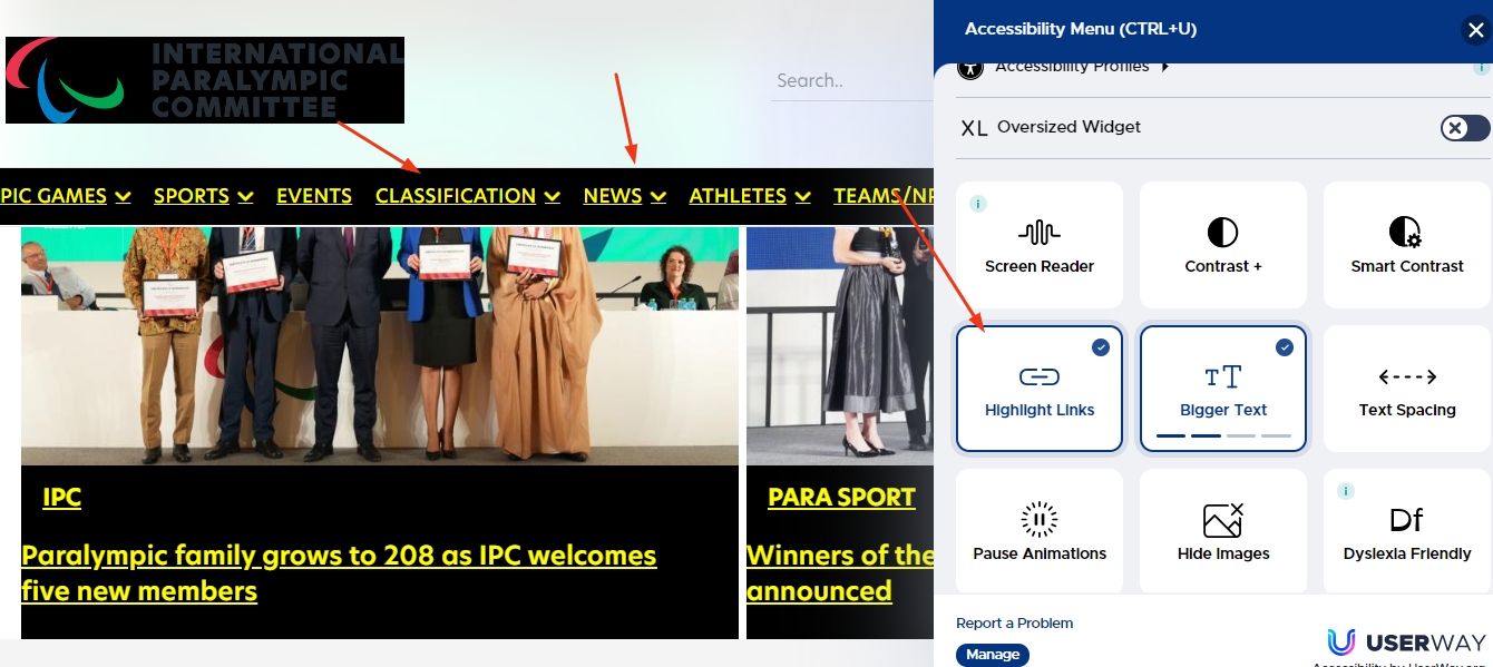
Anchor text is the clickable text in a hyperlink that tells search engines what the linked page is about and helps screen readers identify the text first so readers can determine if they want to click the link.
For accessibility reasons, describe your links and provide context about where they lead. Be concise, add a target keyword, and avoid generic phrases like ‘click here.'
- Write Helpful Alt Text for Images
Including descriptive alt text for images is crucial to making content accessible to visually impaired users. Alt text serves multiple purposes, including helping search engines interpret image content, improving accessibility, and potentially boosting your website's visibility and ranking on Google.
Include descriptive text for any images and videos you add to your website. Screen readers will read this text aloud to describe your visual content to users with disabilities. If there's no section for alt-text, describe your images or videos in a caption. That helps make your content more user-friendly and accessible to everyone.


“As a digital marketer, one of the most valuable tips I received about alt-texts was:
Think about describing this image in a way a visually impaired person could understand. I always share it with new team members to include everyone and improve our communication accuracy.” says Sam Meenasian, Founder of Business Insurance USA.
For example, instead of saying “marketing” for an image, say which kind of service the image is “marketing for law firms.” If your image is of a logo, write “_Company Name _logo.”
- Use Accessible Language
The words you use are as important as how you organize your content. Explicit language and a well-structured format are crucial for making content easy to understand, especially for people with disabilities.
The WAI guidelines state that you should explain uncommon words, idioms, phrases, and abbreviations. Moreover, you should use clear and simple language or provide a simplified version.
We have already examined using simple language to follow the “Understandable” accessibility principle. So, it's essential to keep these points in mind:
- Write short sentences and paragraphs;
- Avoid using jargon or unnecessary words;
- Explain acronyms, metaphors, and abbreviations;
- Include bullet points and create emphasis within the text;
- Indicate the language of your content by using the “lang” attribute in HTML.
- Write clear and unique page titles;
- Be consistent and use valuable tools like Grammarly or the Hemingway App to simplify your content.
- Write Accessible CTAs
User experience and accessibility are closely connected. They both prioritize the user and make products that meet their needs. When you create accessible calls to action with these factors in mind, you ensure that more people can use your content, including those with disabilities, and have a positive experience.
To make practical and accessible CTAs:
- Write action-oriented and descriptive text. Instead of “click here” or “learn more,” say “learn more about our ingredients.”

- Leverage color contrast. The minimum color contrast ratio should be at least 4.5:1 for most people to read the text. However, it can vary based on text size or WCAG conformance level. You can use this contrast checker to determine whether it meets accessibility guidelines.
- Place your primary CTA above the fold so all users can see it without scrolling down the web page.
- Labels and placeholders should be consistent for forms to explain what specific information to fill out in each field and in what format.
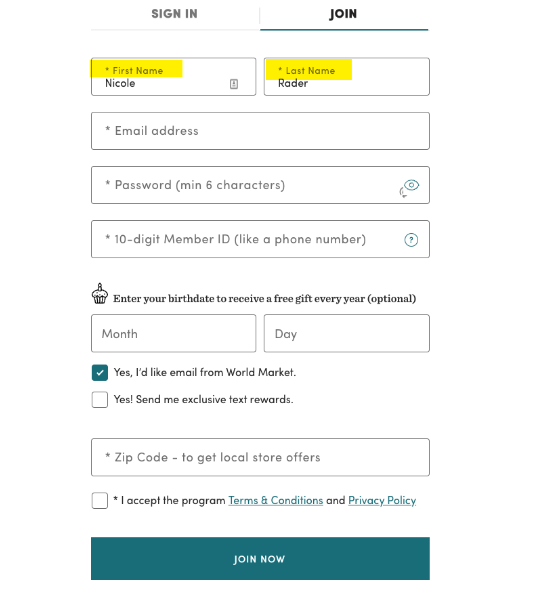
- Build the mobile version of your CTA. Adapt the size and placement of your CTA to ensure it is still effective on smaller screens compared to desktops.
- Add On-Site Sitemaps
An on-site sitemap is important for users with disabilities to find the content they need quickly and for search engines to index your pages. It looks like a detailed map of your website’s structure.
Generally, you focus on an XML sitemap, which is great for search engine crawlers. An HTML sitemap provides a clear, accessible overview of your essential web pages, which lets disabled people find what they're looking for. The main difference between XML and HTML sitemaps is that the first is designed for search engines, while the last is for human visitors.
Ensure to consider the last one and see what it should look like:
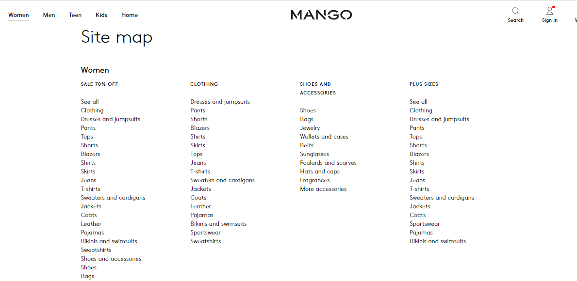
The sitemap has multiple sections, each including subsections showing the different categories and products. The HTML sitemap is usually presented in a clickable format and found in the footer, making it easier for users to navigate your website.
- Evaluate Your Content For Accessibility
Making your content accessible is an ongoing process. It's important to regularly evaluate your website's accessibility and pinpoint areas to improve. Update it as needed, especially when you make specific changes or add new content.
To improve accessibility, request users with disabilities to test your website. Make sure that people can ask for accommodations. Create a pledge for website accessibility and publish it on a webpage. Test your content accessibility and security on different devices. Secure your data and have a trustworthy online presence using SSL certificates.
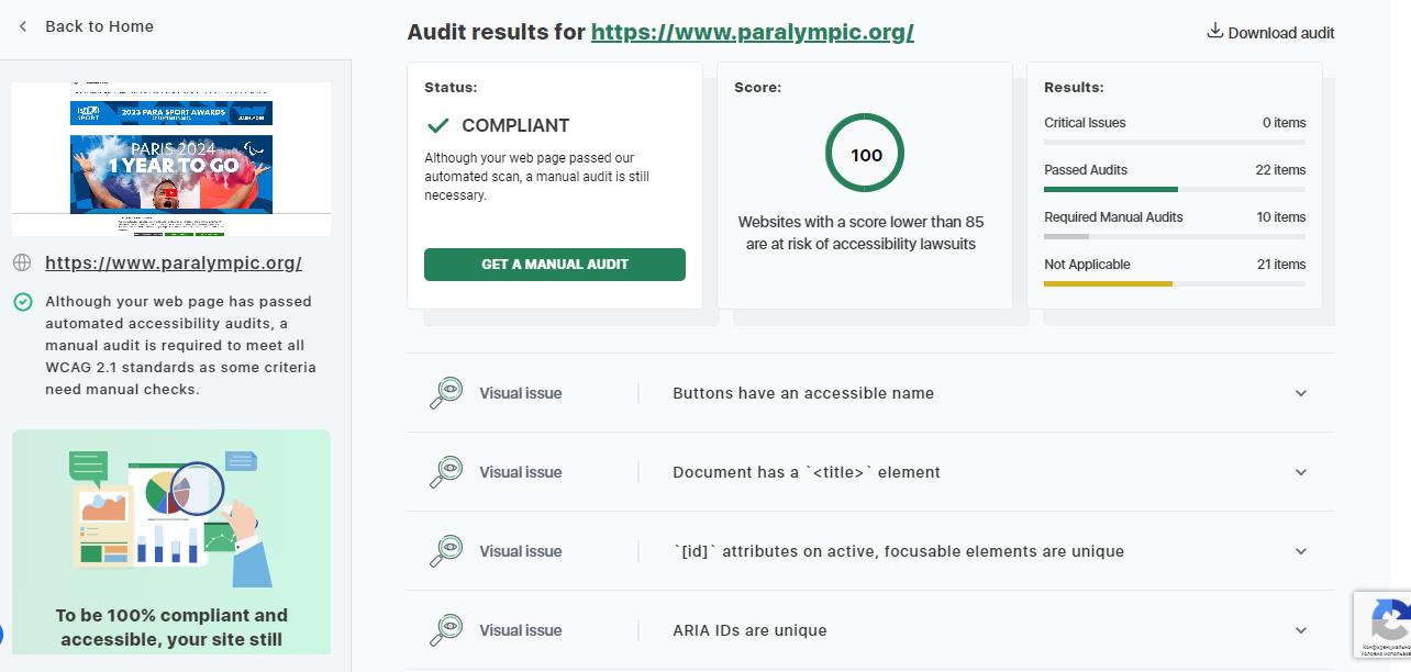
Perform quarterly audits of your content website for accessibility. To evaluate your site's performance, you can use free website accessibility checker tools like Accessibility Checker or Google Lighthouse.
Making Your Content Accessible is a Necessity
Today, it's essential to understand that everyone should be able to access content.
By making online content accessible, you can develop a more inclusive online environment where everyone can access and engage with a wide range of information and resources on the web.
Remember these practices to ensure the content is accessible and understandable to everyone.
Recommended Posts

The Power of UGC (User-Generated Content) in Event Marketing
February 9, 2025

