6 High Converting Email Popup Examples to Learn From
An email popup can be likened to a double-edged sword.
On the one hand, it's a weapon that can generate high conversions and hot leads that can increase your sales. On the other, it's an intrusive and annoying box on your web page that can lead to visitors bouncing off your site.
But here's the thing about email popups; not using them is like opting to walk instead of taking your car, or the bus, to work. You need them if you really want to boost your profits and build your customer base as an online business or a website.
The trick is to optimize them so they contribute to, instead of disrupt the user experience. If you can achieve this, your popups will do more of converting instead of annoying users.
But how do you achieve this? It does seem like a fragile task. How do you design your popups the right way and garner high conversions?
It is highly recommended to read this article about the best email marketing services.
Fortunately, for small and online businesses out there, there are businesses and marketers that answer this question by using email popups as a high-converting machine.
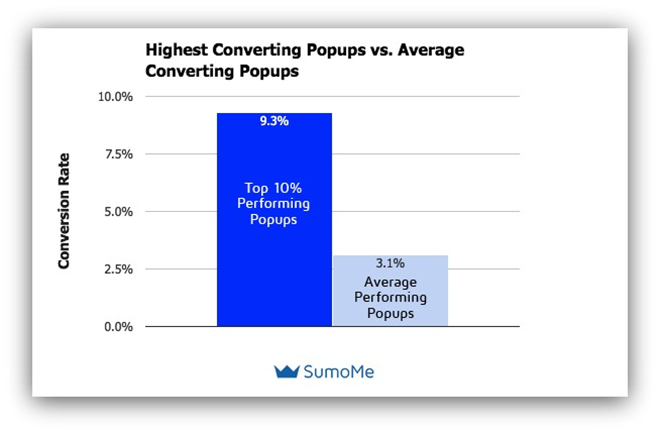
The highest-converting email popups hover close to 10%. That's a very positive statistic for any small online business.
Source: Sumo
In this article, I'll be sharing 6 examples of such high converting email popups that you can learn from.
We will evaluate these examples and reveal what was going for them so you can pick up on what made them so effective.
Creating a High-Converting Email Popup
The 6 examples I'll mention all have certain qualities that any high-converting email popup must have.
Some tools can help you with this, SendPulse, for example, offers more than 30 pop-up templates for free, where you can choose the one that best suits your brand and create the best design for the message.
You can call them the best practices for creating a conversion-optimized email popup using Popup templates. If you want any real chance at generating leads and bulking your email list, then you must take these practices into effect:
Focus on the Incentive
Of course, nobody will even consider submitting their email address if the popup doesn't offer something in return. There are a lot of popup templates that will help you for creating the best popup experience.
This something (usually called a lead magnet) could be free stuff, like free ebooks. It could be price discounts or exclusive and spicy newsletters.
It's not just about offering incentives; it's about utilizing them to your advantage. One major way to do this is by using the psychology of hierarchy.
In simple terms, this means making your lead magnet one of the most prominent elements on your popup design. It needs to be clear, bold, and immediately visible to the user.
The intended effect is to make it more irresistible, and that works more often than not.
For instance, if you're offering a 10% discount on a welcome popup to a new visitor, the “10% off” has to be one of the most visible elements on the popup.
Making your lead magnet call out is one of the oldest tricks in the book and it's one of the best ways to convince users to subscribe to your list.
Provide Context
Context is simply making your popup appear for the right purpose and intent.
This includes considering factors such as which page of the website a user must visit, or what actions a user must take before a popup can be triggered.
Using a popup at the right moment is a vital practice if you want a real shot at high conversions. Otherwise, you would only be creating an irritating popup that would generate low conversions and compromise your overall marketing strategy.
As far as applying the right context is concerned, popups can be designed to appear in the following ways:
- As Welcome Popups: These are triggered when users visit a website for the first time. These are commonly used to offer first-time discounts on ecommerce stores.
- As Exit-Intent Popups: Triggered when a user's about to exit the page.
- As Timed Popups: You set a time limit and the popup appears when users hit that time limit on your site.
- As Scroll Popups: These would appear after users scroll to a certain portion of the page. This is best applied when the popup appears as a follow-up offer on whatever the user has read or viewed up to that point.
- As Page Popups: These popups appear when a user visits a particular page on the website.
Use Popups in Line with Your Sales Funnel
As part of applying context, a popup must fit in with your sales funnel strategy. You must determine if it's better suited for the top, middle, or bottom of the funnel.
For instance, on a blog post about email marketing, (and NOT email marketing tools) showing a popup of a promotional offer or discount on an email marketing tool, like WordPress email marketing plugins, is likely to perform woefully.
Why? Because one, readers of that blog post are most likely not yet as invested to the extent of making a purchase. Two, they're more interested in gaining knowledge rather than making a purchase.
Taking that into account, an appropriate popup for the situation would be one offering a free email marketing ebook. A popup for the email marketing service offer would be better suited for close to the bottom of the funnel.
Get the Timing Right
Timing popups is an intricate maneuver that very few people get right.
It goes without saying that a popup that appears at the wrong time could lead to a bounce rate, or worse, could ruin a sale.
Consumers could bail on a purchase if a popup appears on a product page and frustrates their attempt to familiarize themselves with the details of the product.
Naturally, the best-timed popups are realized after loads of A/B testing, since no one can automatically predict the consumer's mind or what time of browsing might be the least or most convenient. But there's at least one general principle you should consider:
Avoid triggering popups immediately when a user visits your website. A lot of websites do this through welcome mats and it's not always the best practice.
The reason is that they bug users before they've even had the chance to familiarize with your website on any level and that can be frustrating. It annoys more than it pleases, as users usually just want to take in your website and know what it's about before anything else.
An optimal time duration to allow users scan your website before dropping your popup is 3 to 15 seconds, as practiced by a lot of marketers and top websites.
You should of course test this timeframe to find which time bracket works best for you instead of just applying it outright.
Use Brilliant and Branded Design
The design of your popup has to be appealing to users, that should go without saying.
But more importantly, it has to communicate your brand identity, much like how you would design a logo to visually represent your company.
It would feel weird and off-putting if your email popup resembled something from another website.
Your colors, images, fonts, and layout should all properly represent your brand.
Another aspect to a brilliant design is simplicity. A great design is not flashy, it is effective. And most effective designs are not only attractive, they keep it simple and use a lot of white space.
Optimize Your Copy
Your popup copy should be primed for two things: your users' lack of patience and their need for value.
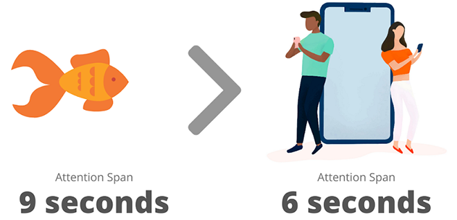
The natural human attention span is very short and for a popup, it's even shorter.
Your copy must be concise, very clear, and straight to the point. Users usually don't want to see more than three short sentences on a popup form at best. At the same time, they should fully grasp the message you're trying to pass across.
Being concise doesn't rob you of adding personality and using exciting and persuasive copy. Simple, straightforward content can do the job, but creating content that is a bit more flair and engaging can do wonders.
Another important value of popup copy (actually, any copy) is transparency. Users don't like to be taken by surprise.
Communicate, in clear terms, what will happen if they submit their email addresses. Will they receive consistent emails? Will they receive only promotional offers or along with news updates?
Really try to avoid making outlandish claims or promises if you're not sure your service can deliver on them.
Optimize Your CTA
An effective CTA button always stands out against the background design. But in a nice contrast of course.
A good knowledge of complementary colors will help you in this case. Some colors work well with others, some don't. You need to be aware of this to avoid creating a hideous design in an attempt to make your CTA visible.
Making your CTA immediately noticeable is not the only way to prime it for conversions. Your CTA copy is another vital aspect.
Your CTA copy has a lot to do in convincing users to fill their emails in or otherwise. It has to match your offer and communicate clearly what it expects the user to do.
A general way to make your copy more effective is to consider using something more than random commands like “subscribe”.
Get more creative with your CTA copy, but in a way that is very relatable to your audience and doesn't take anything away from the main message.
For instance, a first-person CTA like “Sign Me Up!” is more engaging and likely to convert than a stark command like “Subscribe”.
6 Examples of High Converting Emails
So we've covered the basics. Now let's move on to the actual examples and observe how what we just learned was applied.
One thing to note about these examples, they've all had conversion rates of at least 5% and above, and they're real-world examples. This means they used high-converting principles that can actually be applied.
Also, you'll find that these popups are triggered to appear in different ways. That's something you should consider, if you're not already aware.
While I wouldn't go into all the different ways you could manifest your popups, the most common and popularly used ones are:
- Lightbox Popups: These are your “regular” popups that cover a part of the screen and leave the rest semi-transparent.
- Fullscreen Popups: These cover the whole page, and are often used as welcome mats or new-entry popups.
- Click Popups: These only appear after a user has triggered a CTA button or bar.
- Scroll Boxes: These usually appear as a less intrusive box on a small section of your page, often triggered in blog posts after a user has scrolled to a certain point in the post.
- Smart Bars: These appear at the very bottom or top of the page, and stay on the screen permanently. They usually hover and remain visible in their position as a user scrolls the website.
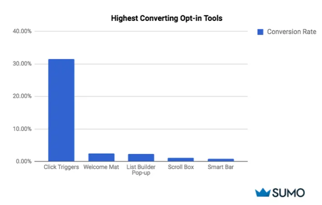
So that's several options you could choose from and while the “best” choice is usually up to your discretion (or testing strategy), it would be helpful to know that according to a research by Sumo, click popups had the highest conversions than most options.
Source: Sumo
The reason? They were the least intrusive and were based on the user's decision.
Okay now let's look into the high-converting email popup examples:
Crossrope
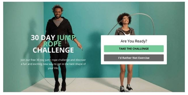
This is an exit-intent and fullscreen popup by Crossrope, a fitness brand. Its purpose was to invite users to participate in a fitness challenge once they tried to leave the website.
What's peculiar about this popup is that it doesn't contain a form field, like other popups. Instead, it contains two CTAs, so users can choose to interact with the popup or not.
Clicking the positive CTA button then brings up an email form, which users can now fill. I'm not certain if this particular process was the major factor in this popup's success, as there are several great qualities to it.
What is however certain, is that the brand enjoyed a 13.71% conversion rate from this popup.
What Makes This Email Popup Generate High Conversions?
For starters, it provides relevant value. There's a clear incentive here. A 30-day jump rope challenge, for an audience that is interested in fitness and are looking for engaging ways to stay active.
That's a major factor; giving the target audience something they are actually interested in. It's not just about using incentives. Incentives work better when they're targeted and relevant, not random.
Another thing that works in this popup is the image. An active image of people exercising by skipping rope and looking happy while doing it represents everything Crossrope's target audience wants to be.
The copy also puts in good effort. The words “…fun and exciting new way to get in the best shape of your life” are pretty refreshing and I'm sure that's what those users want to hear.
I wouldn't say much about the CTA other than the fact that the negative CTA button uses the well known negative psychology.
The words, “I'd rather not exercise” could guilt trip even the strongest-willed fitness enthusiasts into clicking the positive button.
Be careful about using this tactic though, as it can be annoying to users.
Lilach Bullock
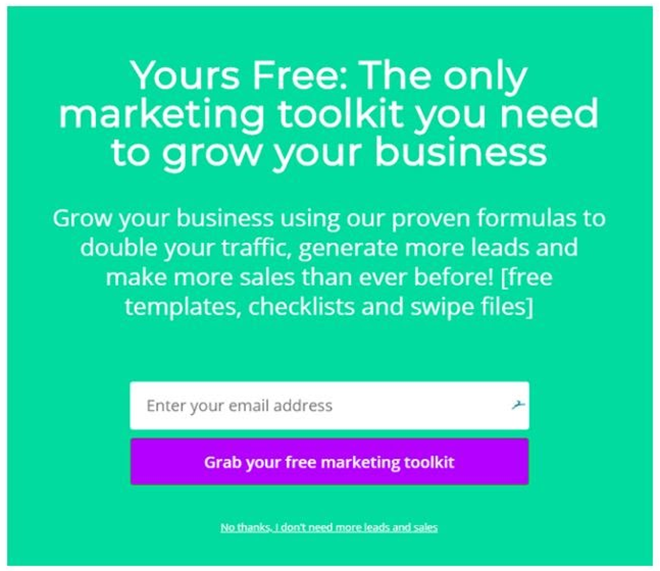
This popup is a welcome mat for first-timers on Lilach Bullock's site.
The popup seems to capitalize on the fact that, as a popular blogger, she already knows what her target audience wants from her site, so she's packaging it into a quite attractive first-time offer.
What Makes This Popup Work?
The copy and the offer. Those are its main weapons. It doesn't do too much in the way of design, it doesn't have to. The simple design does an effective job.
The CTA is the most noticeable thing on the popup, helped very much by the bright and contrasting colors.
But it's the copy and the offer that pack a punch. The copy says things that the target audience wants to hear; “proven formula”, “more leads”, “double traffic”, “more sales”.
Then the offer is a free kit of really useful tools that would deliver on those promises. Surely a hotcake for marketers, if you ask me.
And it proved to be, converting 5.09% of first-time visitors to the site.
Help Scout
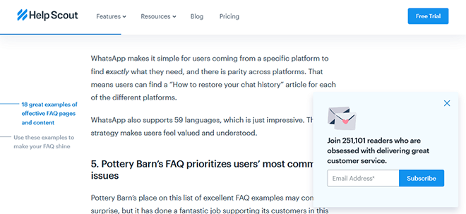
This is a scroll popup that appears to users reading a post about customer service.
An advantage of scroll popups is that they can be very powerful when used right. A scroll popup that appears at a point when readers have been convinced or motivated by whatever information they just consumed would generate high conversions.
In translation, the post primes them, and the popup comes in at the right time, going for the kill.
That's what this popup by Help Scout does.
What Makes This Popup Great?
It's one of the non-intrusive pop-up types. It just slides in a nice, little corner of the screen, not really impeding the browsing experience. Users really like that.
Also, and I think I've stressed this enough, it was applied in the right context.
Major contributors to look at are the social proof and the copy used to back it up.
People will always be influenced by social proof, so the number proof of 251,101 readers is pretty convincing.
Also, the copy actively promises the users what they want with the words, “…obsessed with delivering great customer service”.
Backlinko
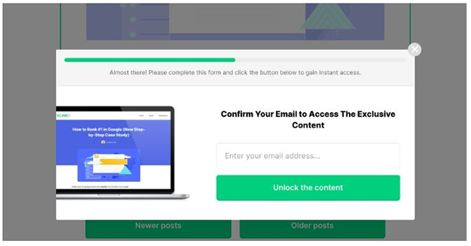
This is a click popup that appears only after users have clicked a CTA button saying “Unlock Now”.
The blog is a top search engine optimization site, and the click to trigger popup appears as the passage to a gated content, which means users have to fill the email form before they can access the content.
This is rather effective for high conversions, especially for this site, as users up to getting to that point, would have recognized the value they could gain from the website and the content.
Filling an email form will seem like a comparatively small price to pay for such value.
Do be careful about applying the same strategy, as Backlinko is already a recognized brand while your brand, which could still be looking to raise awareness, will need people to access content without any friction or mandatory requests that could quite possibly generate a negative reaction.
What Makes This Popup Work?
As a click popup, it's less intrusive and eroding of the user experience. It also does a major job of collecting only genuinely interested leads.
It does get the basics right. The CTA is obvious in a well-contrasted color and the copy is direct and concise. The word “Exclusive” serves as a subtle trigger as well, as users would feel they're being promised something special.
The image that shows the title of the content the users were trying to access stays as a subtle and effective reminder of what they stand to gain.
Neil Strauss
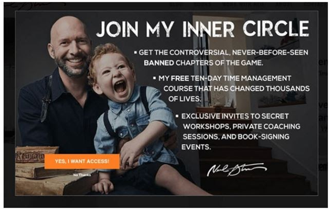
This is an invitation popup sent to users who visit the website of the award-winning journalist and best-selling author Neil Strauss.
This popup rides on the power of exclusivity, inviting users to join Neil's “Inner Circle” with the promise of giving them top-secret and sacred information (that's what he makes it sound like) that they've never before heard in their lives along with a free course and exclusive invites to secret workshops and private coaching.
Yep, that's a lot of valuable insider stuff there. And it's a tact that works well, as he was able to grow his email list by 8% with this popup.
But of course, the value of his incentive was not the only factor here, after all, he had a former popup with a different design that was offering almost the same thing but was only generating 4% conversions.
So What Made This Particular Popup so Effective?
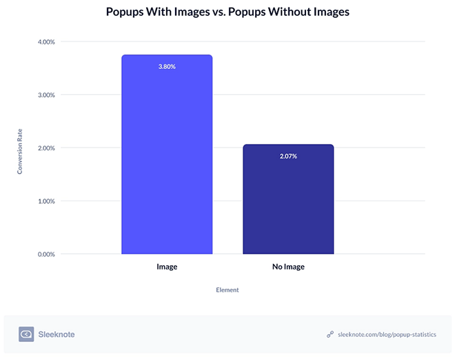
I'll start with the most obvious factor, which is the image. Never doubt the power of images in your email popup.
In fact, according to a research by Sleeknotes, popups with images performed better than popups without.
Source: Sleeknotes
In honesty, the image in this popup is not even a particularly relevant one. It's just a warm, cute photo of him and his little boy with that adorable laughter. Yet it worked.
Why? Because people are naturally drawn to happy and genuine images. Genuine and real-life images, not those annoying stock photos that fool no one.
And also because Neil has clearly built a strong personal brand. His audience are happy to see an image of him smiling and it doesn't have a negative effect on their reactions, even in this scenario.
Just goes to show that your overall marketing strategy and relationship with your consumers are important to your email conversions.
Moving on, the copy is either the next best thing or the best thing. It definitely had a major effect. The bold and well-arranged words clearly spell out the irresistible incentives.
Finally, the CTA copy has an encouraging tone and is used in the first-person pronoun.
Revolve
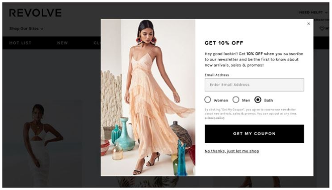
This is an entry popup that offers a 10% discount to first-timers on this ecommerce fashion store.
Entry popups that offer discounts are a common practice for online stores because they're effective.
While entry popups are more annoying than most because of their very intrusive nature, using them to offer site-wide discounts on online stores is an act that is appreciated by most consumers. Nobody hates free stuff.
What Makes This a High-Converting Email Popup?
Starting with the most obvious factor apart from the discount, the image. It showcases the brand's product and uses it to capture an ideal look for this website's audience.
The design is simple and effective, a classic black and white that makes the discount and the CTA prominent.
The form is also primed for personalized emails, as users get to choose their sex.
Personalization is a great way to send more relevant emails to your subscribers. It increases their likelihood of interacting with your emails. This can improve the results of your email campaign by a long stretch.
Making your emails suited to each subscriber's interests and personal details will get you higher email open rates, click-through rates and reduce your chances of going to spam
An important thing to note is how the form smartly avoids using an extra form field for the personalized section by using a bullet tick.
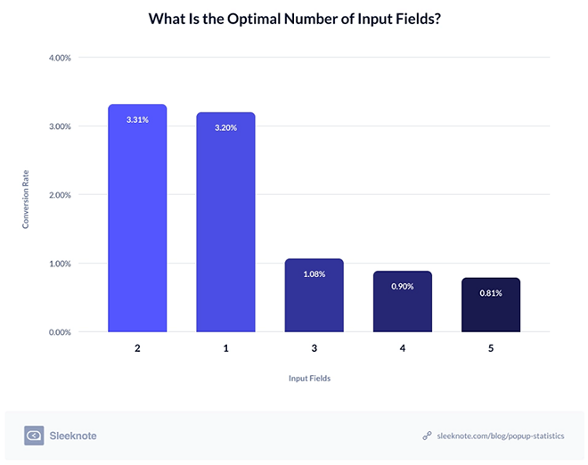
It's common practice to believe that the lower the number of fields, the higher the chances of conversion. More form fields are seen as tasking and discouraging to users.
But research has proven that popups with 2 form fields perform better than popups with 1.
Source: Sleeknotes
The rationale behind using multiple fields is to collect more relevant data for a more effective personalization strategy.
In Conclusion
In conclusion, test all the tips you've learned here before applying them.
For your lead generation and a successful email marketing campaign to work, you need to use a good website service like a website builder that can integrate with an email service like your email newsletter service to streamline your lead generation and nurturing but this efficient process wouldn't be primed for high conversions until you A/B test your elements and strategies.
Your business is its own unique specimen, with its own unique audience. What works generally or for other businesses might not work for you.
When it comes to testing popup forms, it's best to test each element and factor; your copy, the image, design, colors, pop-up type, time, CTA copy and button, etc, one at a time so you can observe which exact changes are affecting your conversions.
The practices in this article are great and conversion-optimized, but the best way to use them is as new benchmarks for your testing strategy.
Recommended Posts
AcyMailing & MEC: A Seamless Integration Guide for 2025
January 28, 2025

Top 5 Email Marketing Tools for Event Promotion in 2025
January 21, 2025
Best Email Integrations for Modern Events Calendar in 2025
December 22, 2024

