The short answer
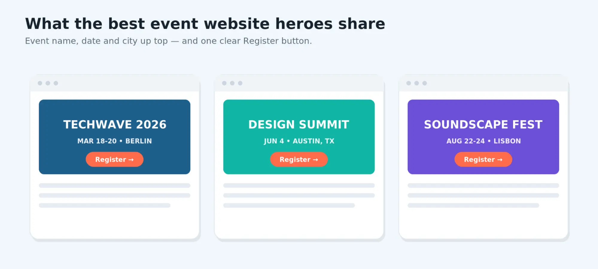
The strongest event website examples all share the same goals: they tell you what the event is, when and where it happens, why you should attend, and exactly what to do next.
Sites like Web Summit, Config by Figma, UNBOUND, Tomorrowland, and Google I/O each solve that in their own visual language, but the underlying pattern is identical.
Below you’ll find ten real examples to browse for inspiration, indicative as to why each one works, and practical ways to rebuild the same patterns on WordPress with Modern Events Calendar and, if you want a head start on design, a Kata event demo.
Websites last reviewed: July 8th, 2026
Event sites are rebuilt for every edition, so the notes and screenshots below reflect the version reviewed on that date. Verify the live site before citing any specific layout detail.
Quick comparison table of event website examples
| Website | Event type | Best for | Standout feature | Main limitation | Score |
|---|---|---|---|---|---|
| Ready-made templates by Webnus, scored with the same test | |||||
| Conference | Conference | Conferences & summits | Speakers, schedule & register sections | Image-led hero; compress media | 5/5 |
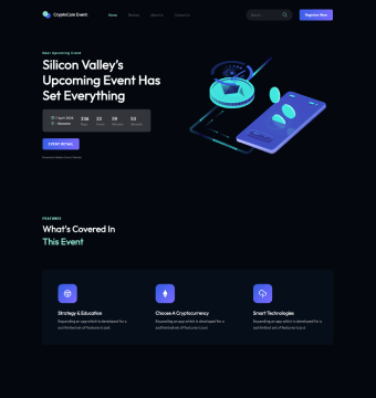
| Tech Seminar | Seminar | Tech & crypto seminars | Countdown hero + event timeline | Register button sits in the menu on mobile | 4/5 |
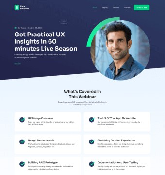
| Webinar | Webinar | Webinars & online classes | “What’s covered” outline + sign-up | Hero CTA is a small text link | 4/5 |
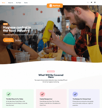
| Festival | Festival | Food & community festivals | Photo-led hero + highlights | No ticket button in the hero | 4/5 |
| 10 real event websites reviewed and scored below | |||||
| Web Summit | Tech conference | Large-scale ticket conversion | Persistent ticket CTA | Dense program deeper in | 5/5 |
| SXSW | Multi-track festival | Complex multi-track programs | Color-coded track wayfinding | Registration a click deeper | 4/5 |
| Config by Figma | Design conference | Design-led brands | Purposeful micro-motion | Motion may tax low-end devices | 4/5 |
| UNBOUND | Business conference | Benefit-first marketing | Benefit-led hero + repeated CTA | Long pages push agenda down | 5/5 |
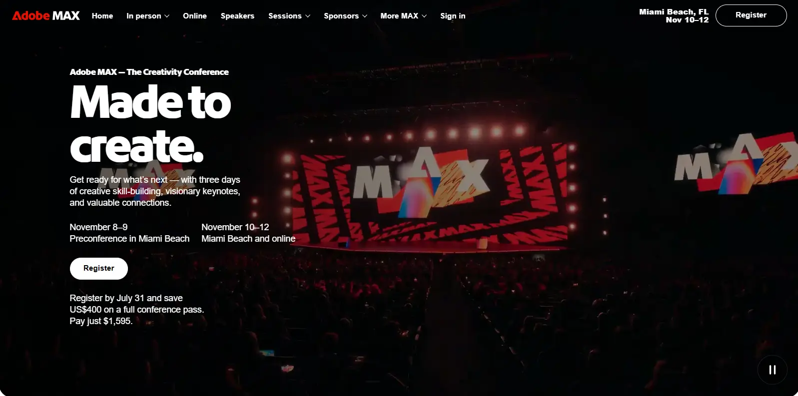
| Adobe MAX | Creative conference | Visual, speaker-driven events | Speaker/session imagery as proof | Heavy media; verify load | 5/5 |
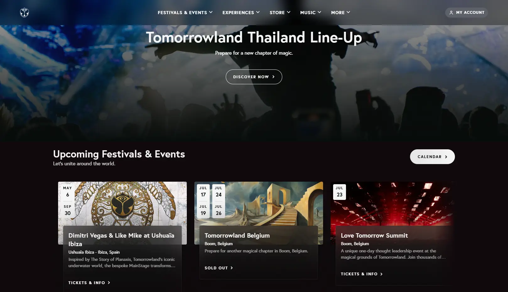
| Tomorrowland | Music festival | Experience-first branding | Immersive hero + ticket bar | Atmosphere can slow first paint | 5/5 |
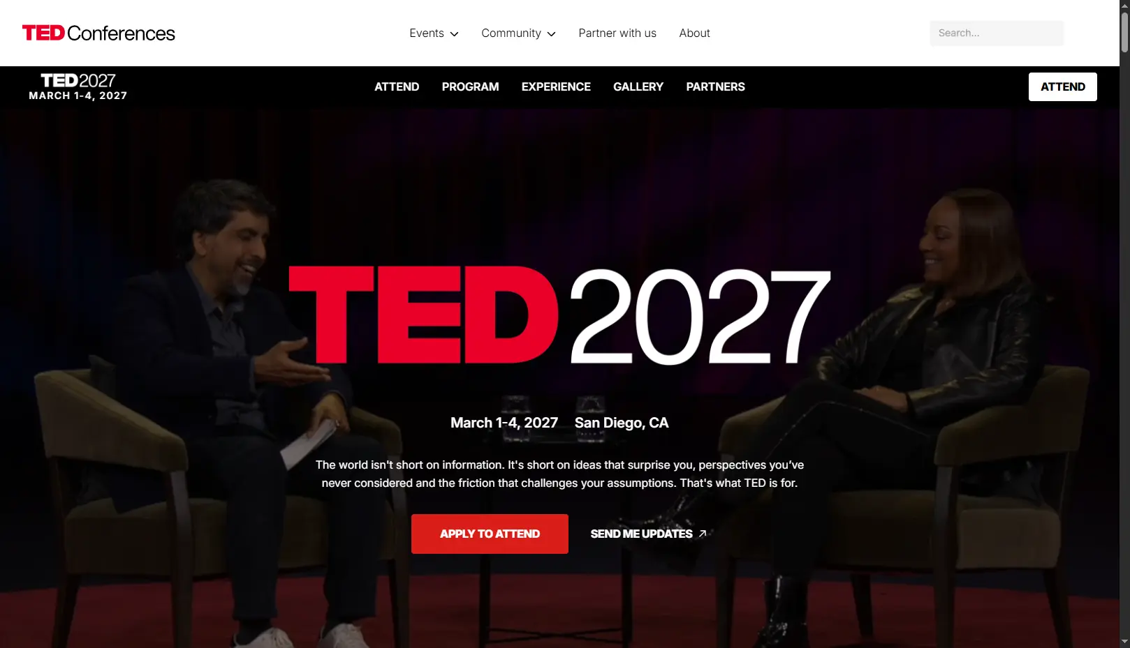
| TED | Ideas / debate | Content-rich programs | Talks as on-page proof | Registration less prominent | 5/5 |
| Awwwards | Design conference | Tiered ticketing | Clear ticket-tier table | Experimental UI can distract | 4/5 |
| CES | Trade show | Multi-audience events | Audience-segmented navigation | Deep nav can bury key info | 5/5 |
| Google I/O | Developer conference | Interactive schedules | Filterable interactive agenda | Minimalism hides detail for some | 4/5 |
Scores reflect the reviewed desktop layout against the 5-Second Event Test below. The four templates are made by Webnus (Kata + Modern Events Calendar) and were scored on their demo content with the same test.
Scores reflect the reviewed desktop layout against the criteria below.
Skip the blank page
Want an event website like these, without starting from scratch?
Pick a ready-made event template, swap in your details, and start taking registrations. Ticketing and booking run on Modern Events Calendar.
Browse Event Templates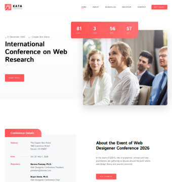
Free to preview · Conference, seminar, webinar & festival designs
How we scored them: the 5-Second Event Test
A great event website passes one test: within about five seconds, a first-time visitor can tell what the event is, when and where it happens, and how to register. Our 5 point rubric is explained in greater detail below.
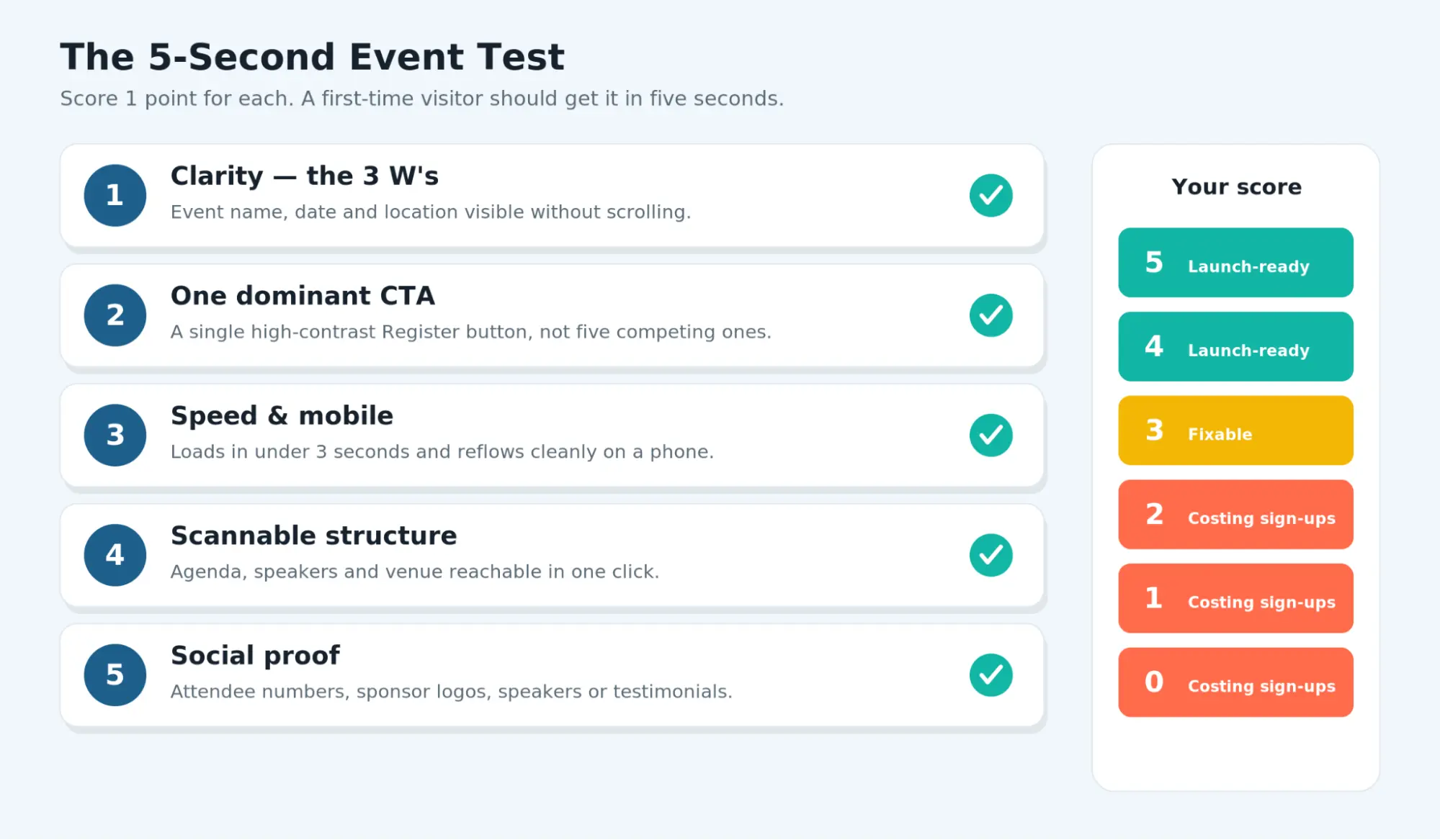
Five core criteria (1 point each):
- Immediate clarity (What, When, Where): event name, date, and location visible without scrolling.
- One dominant CTA: a single, high-contrast “Register” or “Get tickets” button rather than several competing ones.
- Mobile usability & performance: the layout should flow cleanly on a phone and load quickly. We did not run automated mobile or speed tests on these sites, so this criterion is marked “needs verification” throughout.
- Scannable information architecture: agenda, speakers, and venue info reachable in roughly one click.
- Trust & social proof: attendee numbers, sponsor logos, named speakers, or testimonials.
For a technical method that tests the calendar, event page, registration, and checkout separately, follow our event website performance guide.
Bonus criteria that would elevate the user experience: accessibility, agenda usability, speaker presentation, registration friction, branding, and navigation.
How to read the scores. Where we could assess something from the public desktop layout, we call it “Pass” or flag a specific gap. A low score usually points to friction worth fixing, not a verdict on the event itself.
10 event website examples, reviewed
1. Web Summit
- Event type: Global technology conference
- Best for: Large-scale events that depend on ticket conversion
- Standout feature: A recurring, sticky ticket button
- Website reviewed: July 5th, 2026
- Visit the website: Web Summit
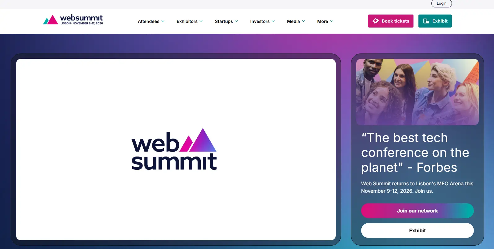
Why it works: Like many of the best event website examples, the hero states the event, dates, and host city and pairs them with a single high-contrast ticket CTA, so the three W’s and the next action land in one screen.
Bold type and high-contrast color blocks keep the page scannable rather than decorative.
What could be improved: The program and side events get dense deeper down the page, which can slow decision-making for first-timers.
Feature to copy: Keep a persistent ticket CTA visible while the visitor scrolls, so the primary action is never more than a glance away.
Recreate it in WordPress: A custom Modern Events Calendar single event page with the booking module positioned above reproduces the persistent-CTA pattern.
| Criterion | Result |
|---|---|
| Immediate clarity | Pass |
| Dominant CTA | Pass |
| Mobile usability & performance | Pass |
| Scannable structure | Pass |
| Trust & social proof | Pass (attendee numbers, partner logos) |
Final score: 5/5 on reviewed desktop/mobile criteria.
2. SXSW
- Event type: Multi-track festival + conference
- Best for: Events juggling several programs at once
- Standout feature: Color-coded track wayfinding
- Website reviewed: July 5th, 2026
- Visit the website: SXSW Schedule
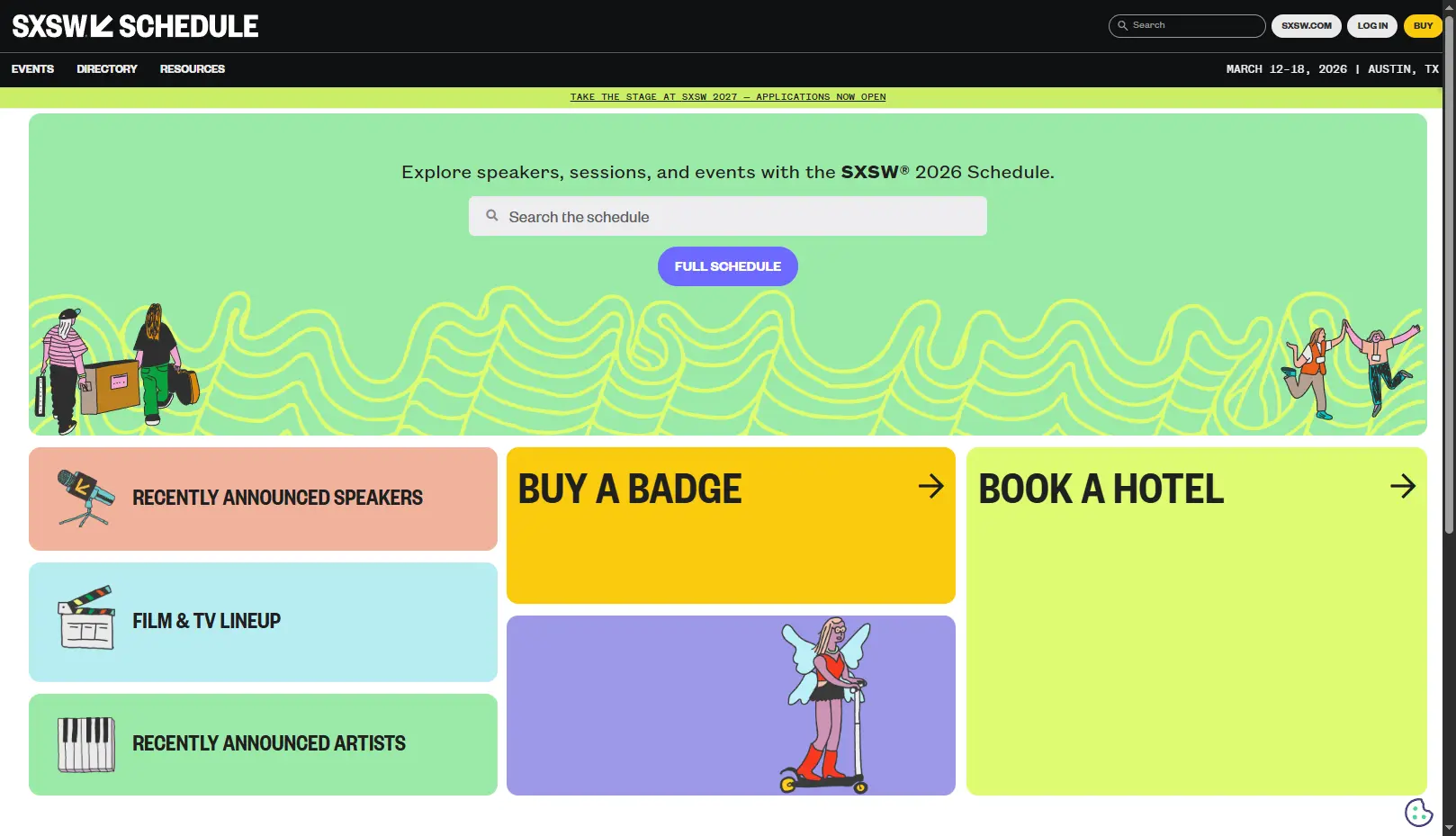
Why it works: With film, music, and tech running together, the site leans on strong wayfinding — clear top-level navigation and color-coded sections — so a visitor finds their track quickly instead of scanning everything.
What could be improved: Registration sits a click deeper than on conversion-first sites, which can add friction for someone who’s already decided.
Feature to copy: Take inspiration from complex event website examples and use a distinct color system to separate tracks or audiences within one site instead of spinning up separate microsites.
Recreate it in WordPress: MEC labels and custom calendar pages can color-code event types, and a filterable calendar view lets visitors narrow to one track.
| Criterion | Result |
|---|---|
| Immediate clarity | Pass |
| Dominant CTA | Partial (register one level down) |
| Mobile usability & performance | Partial (load speed was lower and required more clicks) |
| Scannable structure | Pass |
| Trust & social proof | Pass (attendee numbers, partner logos) |
Final score: 4/5 reviewed on desktop/mobile criteria.
3. Config by Figma
- Event type: Design/product conference
- Best for: Design-led brands that want personality
- Standout feature: Purposeful micro-animation
- Website reviewed: July 5th, 2026
- Visit the website: Figma Config 2026 | June 23-25 – Moscone Center SF
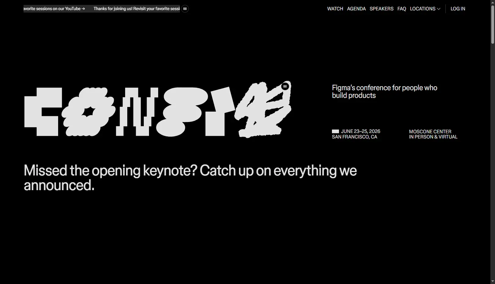
Why it works: The site reflects Figma’s product aesthetic — playful and motion-rich — with attention grabbing animation guides attention toward the agenda but registration had ended during our review so we can’t comment on how it fully works.
What could be improved: Motion-heavy pages can feel sluggish on low-end devices and may reduce accessibility for motion-sensitive users.
Feature to copy: Use restrained micro-animation to direct the eye to the CTA — motion with a job, not motion for its own sake.
Recreate it in WordPress: While MEC’s integration with Elementor offers ways to create unique calendar and event pages, playful animations are not included so you’ll need to rely on animation elements that direct attention towards the calendar, as seen in many stunning event website examples.
| Criterion | Result |
|---|---|
| Immediate clarity | Pass |
| Dominant CTA | N/A |
| Mobile usability & performance | Pass |
| Scannable structure | Pass |
| Trust & social proof | Pass (named speakers) |
Final score: 4/5 on reviewed desktop/mobile criteria.
4. UNBOUND by HubSpot
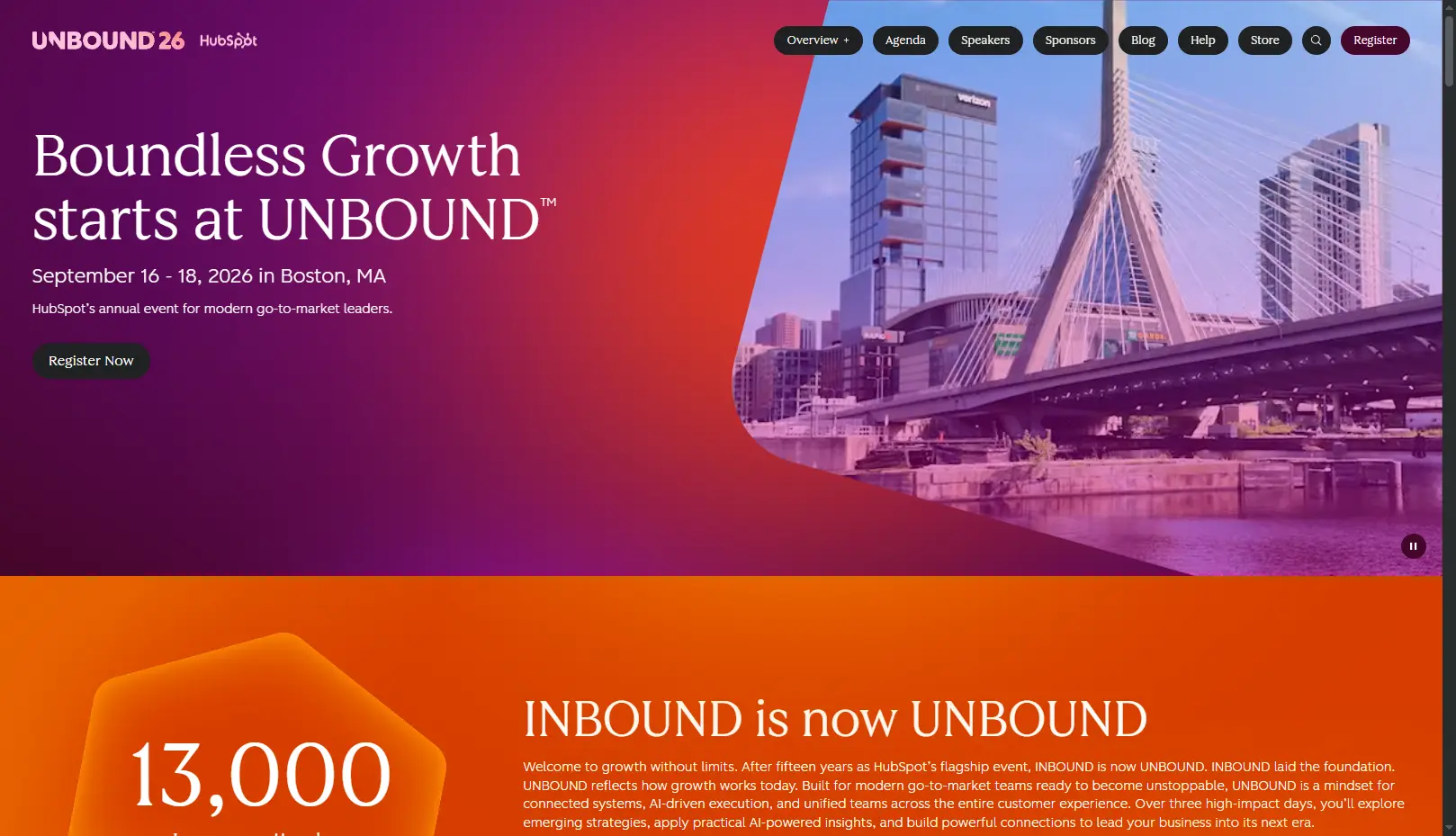
- Event type: Business & marketing conference
- Best for: Events that sell on outcomes, not logistics
- Standout feature: Benefit-led hero with repeated CTA
- Website reviewed: July 5th, 2026
- Visit the website: Unbound (Inbound was rebranded as Unbound in April 2026)
Why it works: As you’d expect from a marketing company, this page shines compared to standard event website examples by opening with the attendee benefit (“why come”), using named speakers as social proof, and repeating the registration CTA at logical scroll points.
What could be improved: Long, benefit-rich pages can push the agenda far down; some visitors want the schedule sooner.
Feature to copy: Lead with the benefit before the logistics — state what the attendee gains before the date, venue, and price.
Recreate it in WordPress: Build a benefit-led hero in your theme/page builder, then embed a MEC schedule and a repeated Booking button on top.
| Criterion | Result |
|---|---|
| Immediate clarity | Pass |
| Dominant CTA | Pass (repeated) |
| Mobile usability & performance | Pass |
| Scannable structure | Pass |
| Trust & social proof | Pass (named speakers) |
Final score: 5/5 on reviewed desktop/mobile criteria
Recreate it in WordPress
Build an event site that converts like these on your own WordPress
Modern Events Calendar handles the calendar, registration and ticketing behind every pattern in this list, with no per-ticket platform fees.
- Booking button on every event pageThe repeated-CTA pattern from UNBOUND & Web Summit
- Multiple ticket types & pricing tiersLike Awwwards’ ticket table
- Color-coded tracks with search filtersSXSW-style wayfinding and a Google I/O-style agenda
- Speaker & organizer profilesThe social proof Adobe MAX relies on
Free version available · Pro from $99/yr · 30-day money-back guarantee
5. Adobe MAX
- Event type: Creative conference
- Best for: Visually rich, speaker-driven events
- Standout feature: Speaker and session imagery as proof
- Website reviewed: July 5th, 2026
- Visit the website: Adobe MAX
Why it works: Creative work and headline speakers sit front and center; the visual quality itself signals the caliber of the event and doubles as social proof.
What could be improved: Image- and video-heavy heroes risk slow loads if media isn’t optimized—a common pitfall in even the best event website examples.
Feature to copy: Let speaker line-up and visuals carry the credibility load instead of relying on text claims.
Recreate it in WordPress: MEC’s Advanced speakers/organizers addons can present speaker imagery prominently.
| Criterion | Result |
|---|---|
| Immediate clarity | Pass |
| Dominant CTA | Pass |
| Mobile usability & performance | Pass |
| Scannable structure | Pass |
| Trust & social proof | Pass (speakers, brand) |
Final score: 5/5 on reviewed desktop/mobile criteria.
6. Tomorrowland
- Event type: Music festival
- Best for: Experience-first, brand-led events
- Standout feature: Immersive hero with a working event bar
- Website reviewed: July 5th, 2026
- Visit the website: Tomorrowland
Why it works: A festival sells a feeling, and the site leans into cinematic visuals — yet it still keeps lineup, dates, and tickets accessible, proving immersive doesn’t have to mean confusing.
What could be improved: Cinematic media can delay first load and hurt performance on slower connections.
Feature to copy: As seen in top-converting event website examples, pair an atmosphere-first hero with a hard-working ticket bar underneath, so mood and action coexist.
Recreate it in WordPress: Leading with a MEC Grid view calendar reproduces the pattern paired together with lazy-load heavy media.
| Criterion | Result |
|---|---|
| Immediate clarity | Pass |
| Dominant CTA | Pass |
| Mobile usability & performance | Pass |
| Scannable structure | Pass |
| Trust & social proof | Pass (named speakers)Pass (lineup, scale) |
Final score: 5/5 on reviewed desktop/mobile criteria.
7. TED
- Event type: Ideas event (nonprofit-style)
- Best for: Content-rich programs
- Standout feature: Talks as on-page social proof
- Website reviewed: July 5th, 2026
- Visit the website: TED2027
Why it works: TED’s event pages use the talks themselves as proof of value; the clean editorial layout and generous whitespace make a content-heavy site feel easy to navigate.
What could be improved: With content as the hero, the registration path can be less prominent than on conversion-first sites.
Feature to copy: Use past session recordings as credible, low-cost social proof near the sign-up.
Recreate it in WordPress:Embed a past-session video in a MEC single event page, with the registration button kept above the fold—a layout commonly seen in successful event website examples.
| Criterion | Result |
|---|---|
| Immediate clarity | Pass |
| Dominant CTA | Pass |
| Mobile usability & performance | Pass |
| Scannable structure | Pass |
| Trust & social proof | Pass (past talks) |
Final score: 5/5 on reviewed desktop/mobile criteria.
8. Awwwards Conference
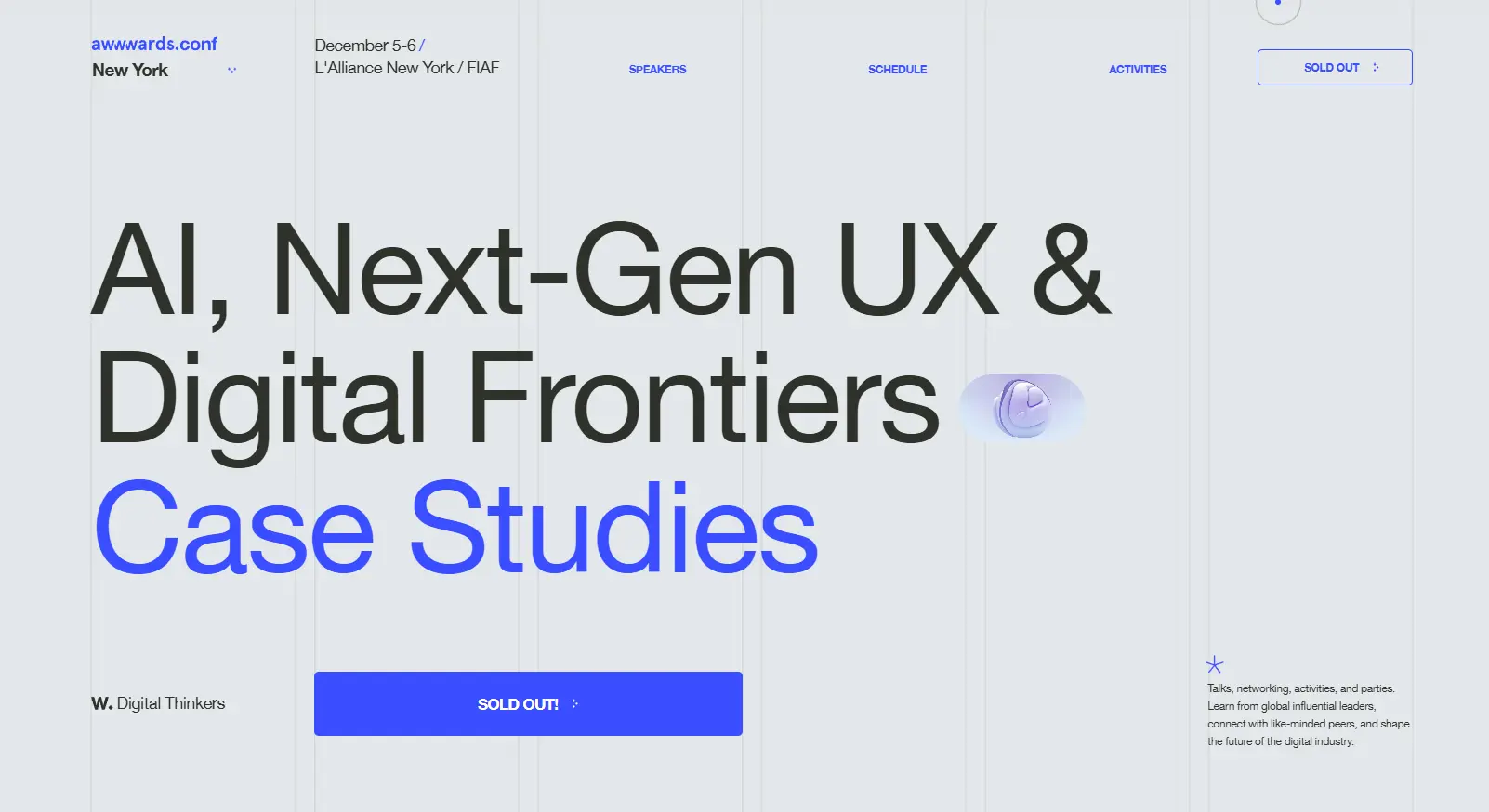
- Event type: Web-design conference
- Best for: Events with multiple ticket tiers
- Standout feature: A clear ticket-tier comparison table
- Website reviewed: July 5th, 2026
- Visit the website: Awwwards Conference
Why it works: As an awards body for web design, Awwwards has to impress designers while staying usable; its pages balance bold visual experimentation with a clear, comparable ticket-tier table.
What could be improved: Experimental UI can occasionally distract from core tasks like choosing a tier.
Feature to copy: Present ticket types in a simple comparison table so price and inclusions are scannable at a glance.
Recreate it in WordPress: MEC supports multiple ticket types and pricing; present them in a comparison table on the event page.
| Criterion | Result |
|---|---|
| Immediate clarity | Pass |
| Dominant CTA | Pass |
| Mobile usability & performance | Fail (Navigation gets stuck) |
| Scannable structure | Pass |
| Trust & social proof | Pass (brand authority) |
Final score: 4/5 on reviewed desktop/mobile criteria.
9. CES
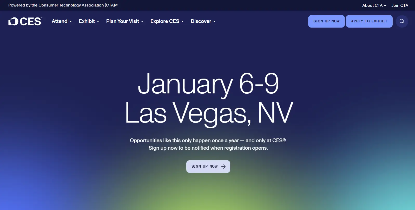
- Event type: Large trade show
- Best for: Events with distinct audiences
- Standout feature: Audience-segmented navigation
- Website reviewed: July 5th, 2026
- Visit the website: CES
Why it works: CES keeps registration, exhibitor info, and schedule cleanly separated by audience; the navigation is built around who you are, not just what’s available.
What could be improved: Deep, segmented navigation can bury key details for someone who doesn’t self-identify quickly.
Feature to copy: Separate navigation by audience type (attendee vs. exhibitor vs. press) so each visitor sees a relevant path.
Recreate it in WordPress: Use theme menus to create audience-based calendars, with MEC handling attendee registration on the relevant branch.
| Criterion | Result |
|---|---|
| Immediate clarity | Pass |
| Dominant CTA | Pass (per audience) |
| Mobile usability & performance | Pass |
| Scannable structure | Pass |
| Trust & social proof | Pass (scale, exhibitors) |
Final score: 5/5 on reviewed desktop/mobile criteria.
10. Google I/O
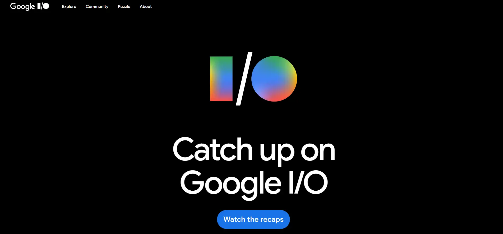
- Event type: Developer conference
- Best for: Schedule-driven events
- Standout feature: An interactive, filterable agenda
- Website reviewed: July 5th, 2026
- Visit the website: Google I/O
Why it works: The site is famously stripped back — a focused hero, an interactive schedule, and a clear “register interest” flow — which keeps a globally massive event feeling approachable.
What could be improved: Minimalism can hide detail that some attendees want up front (pricing, venue specifics).
Feature to copy: Make an interactive, filterable agenda the page’s centerpiece for schedule-heavy events.
Recreate it in WordPress: MEC’s Minimal skin with filters approximate an interactive agenda.
| Criterion | Result |
|---|---|
| Immediate clarity | Pass |
| Dominant CTA | Lacks clarity |
| Mobile usability & performance | Pass |
| Scannable structure | Pass (filterable) |
| Trust & social proof | Pass (speakers) |
Final score: 4/5 on reviewed desktop/mobile criteria.
More event website examples to explore
The ten event sites above are large, well-funded events. For more attainable inspiration, these are real event website examples built on WordPress with Modern Events Calendar — closer to what a small team or nonprofit can ship.
See the full write-ups in our MEC event-website showcase.
- Dayton Art Institute — Museum / nonprofit —
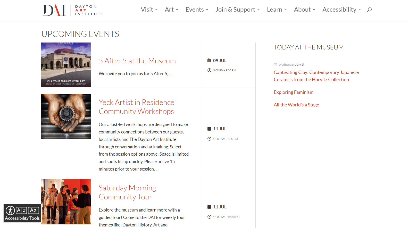
Uses an MEC calendar of exhibitions, lectures, and workshops with easy registration. → Dayton Art Institute
- Big Island Pulse — Community / local events —
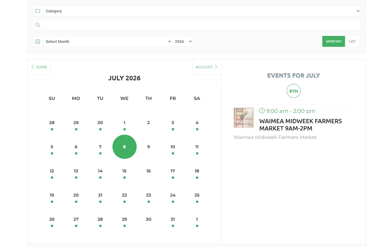
— A community hub surfacing local events in a clean calendar. → Big Island Pulse
- Binger Bühne — Theatre / arts —
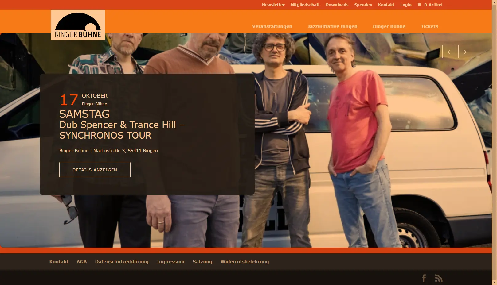
— A Slider view music performance calendar with rich single-event sidebars (location, maps, organizers). → Binger Bühne
What makes a great event website?
Across every example, effective event websites get two things right: the conversion and design layer a visitor sees, and the operational layer that runs registration behind it.
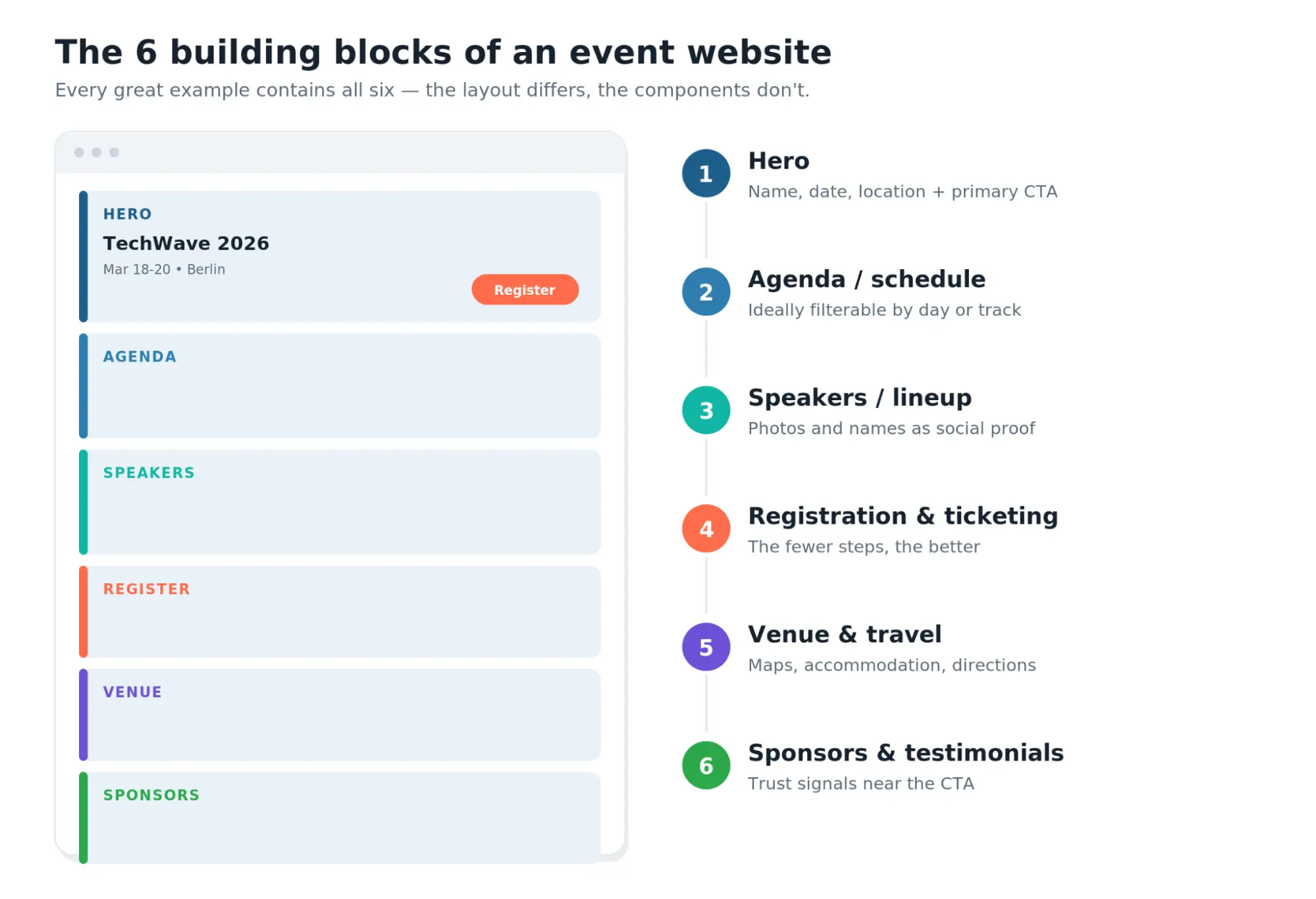
Conversion and design essentials
When reviewing top event website examples, you will notice they consistently include these essential elements
- A clear hero with the event name, date, and location together.
- One dominant CTA — register or get tickets — with obvious contrast.
- An agenda or schedule, ideally filterable for multi-track events.
- Speakers or lineup presented with names and photos as social proof.
- Venue details (or virtual access) that are easy to find.
- Social proof — attendee numbers, sponsor logos, or testimonials — near the CTA.
- Mobile-friendly navigation that reflows cleanly on a phone.
- Consistent branding so the event feels trustworthy.
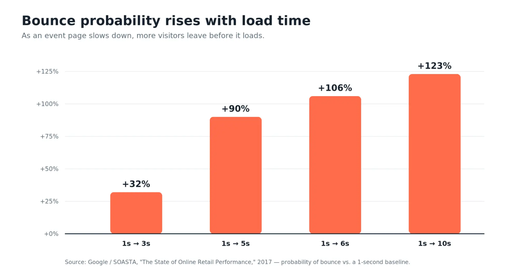
- A fast page experience, since heavy hero media is the usual cause of slow loads. As load time grows, the likelihood a visitor leaves rises sharply.
What are operational essentials in an event website?
Behind the stunning designs of top event website examples, these operational features are less visible but decide whether registration actually works. On WordPress, Modern Events Calendar covers most of them directly:
- Registration & ticketing — multiple ticket types, pricing, and secure checkout.
- Capacity limits — cap seats per ticket type.
- Waiting lists — MEC offers a Waiting List add-on for sold-out events.
- Payment options — PayPal, Stripe, Square, and WooCommerce integrations.
- Confirmation emails & reminders — automated booking confirmations, reminders, and follow-ups.
- Attendee management — an attendee list with live check-in status (QR check-in via the Ticket & Invoice add-on).
- Maps & travel — location and map layouts for in-person events.
- Multilingual support — WPML compatibility for international audiences.
- Accessibility — plan for it deliberately; responsive layout is a start, but confirm contrast, keyboard access, and screen-reader behavior through testing.
- Analytics & consent — connect analytics and a consent banner via standard WordPress tools.
- Hybrid or virtual access — MEC supports virtual, in-person, and hybrid events.
- Post-event resources — recordings, follow-up emails, and downloadable files.
Real websites vs. templates vs. custom builds
Before choosing how to build your website, use our comparison of event management platforms to evaluate ownership, registration, attendee tools, and pricing.
Inspiration comes in a few forms, and they’re not interchangeable:
- Real event website examples (the ten above) show how organizers handle actual information, ticketing, schedules, speakers, and trust under real constraints.
- Event website templates (like Kata’s event demos) give you a professional starting layout to import and adapt — faster, but you still supply your own content and event functionality.
- Concept designs (Dribbble/Behance shots) look striking but usually aren’t buildable as-is; treat them as mood, not blueprint.
- Fully custom builds offer total control at the cost of time and budget.
Real sites teach you what to build; templates get you a head start on the layout; MEC supplies the event functionality underneath either one.
Prefer a ready-made starting point? Try Kata event website demos
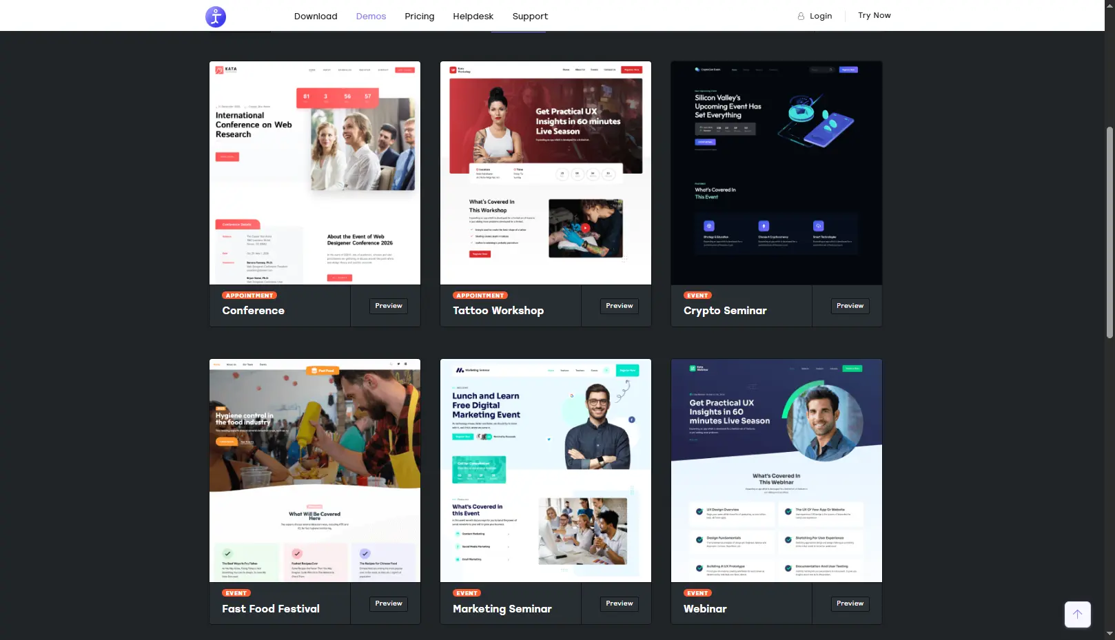
The real websites above are for inspiration; if you’d rather start from a finished layout, Kata ships several event-specific demos you can import and customize. Browse them all on the Kata demos page (filter by “Event”).
- Conference demo — Best for: multi-session conferences. Layout: agenda, speaker sections, hero with dates. Still to customize: your content, branding, and the event/registration functionality. → Kata Conference
- Webinar demo — Best for: single-session virtual events and webinars. Layout: focused hero, sign-up sections. Still to add: your webinar access and registration flow. → Kata Webinar
- Marketing Seminar demo — Best for: business seminars and workshops. Layout: benefit-led hero, schedule, speaker blocks. Still to add: dates, speakers, registration. → Kata Seminar
- Fast Food Festival demo — Best for: festivals and community/food events. Layout: vibrant hero, lineup/vendor sections. Still to add: lineup, dates, ticketing. → Kata Festival
Important: A Kata demo provides design and page layout only. It does not, by itself, include ticketing or event management — that functionality comes from Modern Events Calendar.
Think of it as the perfect stack for building standout event website examples: Kata for the look, MEC for the event engine, WordPress for ownership.
The products behind a WordPress event build
Modern Events Calendar (primary)
Modern Events Calendar is the event-management engine. Accurately, it provides:
- Event listings and 50+ calendar/display layouts (grid, list, calendar, timetable, carousel, map).
- Single event pages you can design, plus schedules and a speakers/organizers module.
- Registration, booking, and ticketing with multiple ticket types, pricing, and capacity limits.
- Recurring events, RSVP and Waiting List add-ons, and Seat reservation.
- Payment gateways (PayPal, Stripe, Square, WooCommerce) and QR check-in app for iOS and Android via the Ticket & Invoice add-on.
- Integrations including Google Calendar, Mailchimp, HubSpot, and WPML; virtual, in-person, and hybrid support.
The free version of MEC (Lite) can be downloaded directly from the website; advanced booking, ticketing, and premium layouts are part of MEC Pro.
Kata (optional design/demo layer)
Kata is an optional multipurpose theme whose value here is its event-specific demos — a faster visual starting point. Kata and MEC are not interchangeable:
- Kata provides design and page layout.
- MEC provides the event functionality (calendar, registration, booking, ticketing).
Which build approach is right for you?
There’s no universally best option — it depends on how much control, budget, and setup time you have.
| Dimension | Hosted platform | WordPress + MEC (+ Kata demo) | Fully custom |
|---|---|---|---|
| Best for | Easy | Easy | Easy |
| Setup speed | Separate Appointment Schedules feature | None | Strong |
| Ownership & data | No built-in ticketing | External links only | Not its main purpose |
| Customization | Embedded display | Yes | Widget or hosted booking page |
| Event functionality | Not provided by the standard embed | No | No |
| Maintenance | Low | Theme-dependent | Moderate |
| Cost | Limited for event management | Limited | Yes for appointments |
If you specifically value control, customization, and owning your data and design, WordPress with MEC (and an optional Kata event demo) is a strong middle path.
For a fully managed experience with minimal setup, a hosted platform may fit better — weigh the per-ticket costs and reduced control.
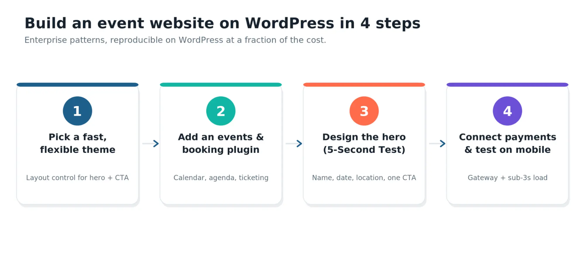
Recreating these patterns on WordPress, in four steps. Full walkthrough: creating an event website with WordPress.
The Bottom Line
The strongest event websites make the event immediately understandable, prioritize one main action, organize complex information clearly, build trust, and reduce registration friction.
Flashy design is optional; that clarity is not. Pick two or three patterns from the event website examples above — a persistent ticket CTA, a filterable agenda, audience-segmented navigation — and apply them to your own site.
Then measure your registration rate as the real scoreboard.
Ready to build? Explore Modern Events Calendar for the calendar, registration, and ticketing, browse the Kata event demos if you want a ready-made layout, and follow our step-by-step WordPress guide to put the patterns together.
Your turn
Ready to Build Your Own Event Website?
Modern Events Calendar gives WordPress sites the event listings, calendar layouts, registration, ticketing, payment, and attendee tools behind the patterns in these examples.
Free version available · Pro from $99/yr · 30-day money-back guarantee
Frequently asked questions
1. What makes a good event website?
A good event website communicates the event name, date, and location immediately, offers one dominant registration CTA, stays scannable, works on mobile, and shows trust signals like speakers or attendee numbers.
2. What should an event website include?
At minimum: a hero with the 3 W’s, an agenda, a speakers/lineup section, venue or virtual-access details, a registration/ticketing flow, and social proof.
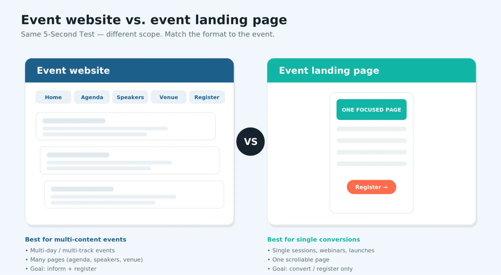
3. What is the difference between an event website and an event landing page?
An event website is a multi-page hub (home, agenda, speakers, venue, register).
An event landing page is a single focused page built around one conversion goal — better for webinars, workshops, or launches. Both should answer what, when, and why attend on the first screen.
4. Should I use a template or build a custom event website?
A template gets you a professional layout quickly and suits most organizers.
A fully custom build makes sense when your workflow is unusual and you have development resources. Either way, event functionality comes from a plugin like MEC.
5. Can I create an event website with WordPress?
Yes. WordPress is one of the most widely used platforms for event sites. Paired with Modern Events Calendar for calendars and registration, it can reproduce the patterns used by major conferences.
6. How can I make an event website mobile-friendly?
Use a responsive layout, keep the registration CTA reachable without pinch-zoom, compress hero media, and test on real devices.
7. How many CTAs should an event page have?
One dominant CTA (register/get tickets), repeated at natural scroll points. Avoid several competing primary buttons, which dilute the main action.
8. What information should appear above the fold?
The event name, date, and location, plus the primary registration CTA. Everything else — agenda, speakers, venue, pricing — can follow below.