


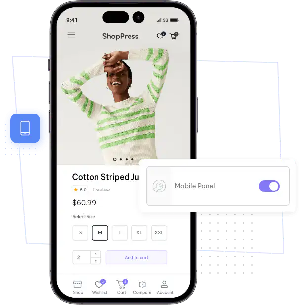

You can customize every WooCommerce pages using Elementor page builder
ShopPress Builder offers this option and it allows your users to simply filter products by Category, Brand, Color, Rating, Tag, Size and Price, and find what they are looking for in a matter of seconds.
Off-Canvas panel widget is a fly-out content panel for showcasing contents like WooCommerce Filter, Wishlist, Cart etc. This panel can be in various formats like, Drop-Down, Popup and Slide-in.
The ShopPress Mobile Panel is an exclusive and high-end feature that adds a sleek and user-friendly bar at the bottom of web pages, specifically designed for devices with screen sizes of 768px or less.

This unique feature not only enhances the visual appeal of your website but also provides convenient and easy access to important functionalities, making it an essential tool for any business looking to optimize their mobile user experience.
The ShopPress Mobile Panel is a high-end feature designed for mobile devices with small screens. It adds a user-friendly bar at the bottom of web pages that enhances the visual appeal of your website and provides easy access to important functionalities. It's an essential tool for businesses looking to optimize their mobile user experience.
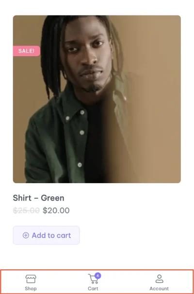
The ShopPress Mobile Panel adds a fixed bar to the bottom of your WooCommerce store on screens 768 pixels wide or smaller. Each item can link to the user account, product comparison, shopping cart or a custom page, with its own title, label and icon. The Mobile Panel is included in both ShopPress Free and ShopPress Pro.
| Setting | What it does |
|---|---|
| Item type | User account, product comparison, shopping cart or a custom page |
| Title and label | The text for each item |
| Icon | Upload your own icon to replace the default |
| Screen size | Shown on devices 768px wide or smaller |
Full guide: read the documentation →
Yes. It is included in ShopPress Free and ShopPress Pro.
On screens 768 pixels wide or smaller.
Yes. Add custom pages as items.
Yes. Upload an icon for each item.
Last updated: November 2026

ShopPress fully compatible with most of the popular WooCommerce themes and plugins, is all you need to run a shop. For more information please refer to ShopPress knowledge-base.

Subscribe to our newsletter and receive our news and promotions
You can unsubscribe at any time